Introduction to HTML/CSS
If you are the content provider
, read HTML. If you are the graphic designer
, read CSS. If you are a programmer and want to add dynamic effects to your web page, read JavaScript. But if you operate in OMO (one-man-operated) and are expected to create a reasonably good-looking website, you need to understand HTML, CSS and JavaScript. This is the reason that I combine both the HTML and CSS in this article as they are inseparable.
To create an OMO website, I suggest that:
- Understand HTML, CSS and JavaScript thoroughly.
- Pick an authoring tool: Use Dreamweaver if you can afford. Otherwise, find a free source-code editor (such as VS Code, Sublime Text, Sublime Text, NotePad++). For programmers, Eclipse/NetBeans/VSCode are good choice for HTML/CSS/JavaScript as they perform syntax checking and provide auto-code-complete.
- Design and organize your page. Decide on the look and feel of your website. How many columns? What are the major sections (e.g., header, navigation menu, main content, sidebar, table of content, footer)? Do you need a navigation menu or panel? What is your theme (colors, fonts)? And so on.
- Take a close look at your favorite websites!!! CSS is humongous and complex! You can't invent this wheel! Use F12 Debugger to inspect HTML/CSS of your favorite websites.
Use a CSS framework, such as BootStrap, to jump-start your design. - Start with an initial CSS design. Website design begins with CSS, NOT HTML?!. Work on your CSS:
- Partition your web page into logical section via
<div>(or HTML5'<header>,<footer>,<section>,<nav>), such as header, content, footer. Assign anidto<div>that is unique (e.g., "header", "footer". Assign a common classname to sections (non-unique) that share the same style (e.g., "entry", "side-note"). Write the CSS id-selectors and class-selectors (e.g.,#header tag-name,...#footer tag-name,...#menu tag-name,...) for common tags (such ash1,h2,h3,p,a:link,a:visited,a:hover,a:active), in each of the<div>'s. Basically, what I am saying is to design each of the sections by itself - a "divide and conquer" strategy. - Create sub-classes for common styles, such as layout out tables and images and special effects (e.g., "
.highlight", ".underline", ".center"). They could be used in<div>and<span>. - There are many good and free CSS templates (or web templates) available online (just google "CSS Templates" or "Web templates"). Pick one that meets your taste to model after. You can also look at the CSS of any website that you find interesting. Be aware of the Intellectual Property Right, do not use any images or graphics unless they are in the public domain. It is extremely easy to create one yourself with an imaging tool, such as PhotoShop, Element, Illustrator or even Paint.
Use a CSS framework, such as BootStrap; and pick your favorite design from the samples.
- Partition your web page into logical section via
- Write your HTML pages. You may need to modify the CSS as you go along. The most challenging thing for an OMO web author is that he has to be concerned about both the contents and appearances at the same time, and can lose focus at times!
- Repeat the previous steps until you are happy with your page's look and feel, layout, and most importantly, the contents - try not to create yet another insignificant website.
I wrote the above many years ago while creating these web pages (You can check out my CSS). Today, I would recommend that you learn the basics of HTML/CSS, but quickly jump into a framework such as BootStrap to produce professional-looking web pages. You can't write better than these people!
Introduction to HTML
What is HTML (HyperText Markup Language)?
- HTML is the language for publishing web pages on the WWW (World-Wide Web, or World-Wide Wait?).
- HTML is a Document Description Language (aka Document Markup Language). HTML is the standard markup language for documents designed to be displayed in a web browser. HTML is NOT a programming language like C/C++/C#/Java, which is used to implement programming algorithm.
- An HTML document is a text document, and it is human-readable.
- Today, HTML works together with CSS (Cascading Style Sheets) (for layout) and JavaScript (for programming).
HTML Versions
- HTML Draft (October 1991): Tim Bernes-Lee (of CERN) proposed the early HTML (with 18 tags) for sharing of document in a hypertext system.
- HTML 2.0 (November 24, 1995): Published as IETF RFC 1866.
- HTML 3.2 (January 14, 1997): Published as W3C HTML 3.2 Recommendation.
- HTML 4.0 (December 1997): Published as W3C HTML 4.0 Recommendation, with strict, transitional and frameset. In December 24, 1999, HTML 4.01 was published as the final HTML specification by W3C. In May 2000, HTML 4.01 Strict as published as ISO/IEC International Standard 15445:2000.
- XHTML 1.0 (January 2000): W3C considered HTML 4.01 as the final HTML, and moved on to develop XHTML 1.0 with stricter rules and syntaxes, followed by XHTML 2.0. XHTML 2.0, although theoretically elegant, is impractical as it is not backward compatible with HTML4/XHTML1.0. A rebel group called WHATWG (Web Hypertext Application Technology Working Group) continued to work on extending HTML with more features in a backward-compatible manner. In 2004, WHATWG released HTML5. By 2007, HTML5 has captured the attention of the developers. W3C decided to abandon the XHTML 2.0 and embraced the HTML5.
- HTML 5 (October 28, 2014): HTML 5 was published as W3C Recommendation, followed by HTML 5.1 on November 1, 2016, and HTML 5.2 in December 14, 2017.
- On 28 May 2019, the W3C announced that WHATWG would be the sole publisher of the HTML and DOM standards.
Today, the prevailing specifications are HTML5 (@ https://html.spec.whatwg.org/multipage/). Nonetheless, the most interesting thing about standards is that nobody really follows them strictly. Every browser (Chrome, Firefox, Opera, Safari and Internet Explorer) has its own variations and support the standards to various extents (so as to out-do others).
Markup Tags
HTML uses markup tags, such as <p> (for Paragraph), <h1> to <h6> (for Heading Level 1 to 6), <img> (for Image), <a> (for Anchor or Hyperlink), to markup a document. HTML markup tags perform these functions:
- Layout the documents, e.g.,
<p>(layout as a paragraph),<h1>to<h6>(layout as heading level 1 to 6),<br>(perform a line break),<hr>(draw a horizontal rule),<table>(tabulating data),<ol>(layout an ordered list). - Provide link (called hyperlink) to another HTML document, via the
<a>(Anchor tag). These hyperlinks, a distinct feature in HTML, greatly help the users in navigating the web and enrich the users' experience. Hyperlinks make the HTML popular. - Embed images, audios, videos, programs (in JavaScript, VBScript, Applet, Flash, or MS ActiveX control), and objects within an HTML document. HTML is multimedia! The hypertext document may contain texts, images, audios, videos, and even programs.
Separating Content and Presentation
The purpose of a markup language is to relieve the content provider from worrying about the actual appearance of the document. The author merely indicates (via markup tags) the semantic meaning of the words and sentences (such as paragraph, heading, emphasis, and strong), and leave it to the browser to interpret the markups and render the document for display on the screen. In other words, it allows the separation of content and presentation. The content provider focuses on the document contents, while the graphic designer concentrates on the view and presentation.
Nowadays, HTML should be used solely to markup the contents, while its companion technology known as CSS (Cascading Style Sheet) be used for defining the presentation of the document, so as to separate the content and presentation.
These are the common pitfalls in older HTML documents and you should avoid:
- Do not specify "appearance" properties, such as foreground and background color, text alignment, font face, font size, border, margin and padding, in the HTML document. Use an external CSS instead to set the appearance and presentation. Presentation-related tags (such as
<font>,<center>) and attributes (such asalign,bgcolor,link,vlink,alink) have been deprecated in HTML 4, in favor of CSS. - Do not use nested tables or frame for formatting the document, use
<div>and<span>, or HTML5 new tags such as<header>,<footer>, and<section>.
HTML Authoring Tools
HTML documents can be created by a wide range of tools, from simple plain-text editors (not recommended), source-code editor (e.g., VS Code, Sublime Text, Notepad++), programming IDE (e.g., Eclipse, NetBeans) to sophisticated WYSIWYG (What You See Is What You Get) editors (e.g., Dreamweaver).
HTML By Examples
Let's go thru some HTML examples and the syntaxes. Do not attempt to start designing your website until you understand the CSS.
Example 1: Basic Layout of an HTML Document
Let's begin with a simple example to illustrate the basic layout of an HTML document.
<!DOCTYPE html>
<html lang="en">
<head>
  <meta charset="utf-8">
  <title>Basic HTML Document Layout</title>
</head>
<body>
  <h1>My First Web Page</h1>
  <hr>
  <p>This is my <strong>first</strong> web page written in HTML.</p>
  <h3>HTML</h3>
  <p>HTML uses <mark>markup tag</mark> to <em>markup</em> a document.</p>
</body>
</html>
Use a source-code editor, which provides syntax highlighting, auto-code-complete, snippets, etc (such as VS Code, Sublime Text, Atom, NotePad++) to enter the above HTML codes and save as "MyFirstWebPage.html".
Notes: If you use macOS's default TextEdit (NOT Recommended), select "Format" to "Make Plain Text" and choose "Unicode (UTF-8)" for character encoding before saving your file. Also, Windows NotePad is NOT Recommended, as it does not provide syntax highlighting, auto-code-complete, snippets, etc.
Open the file in a browser (such as Firefox, Internet Explorer/Edge, Chrome, Safari, Opera) by double-clicking the file; or drag and drop the file into the browser; or through the browser's "File" menu ⇒ "Open File..." ⇒ "Browse..." and select the file.
How it Works?
- An HTML document begins with a Document-Type Declaration
<!DOCTYPE html>(Line 1) to identify itself as an HTML document to the browser. - The HTML content is contained within a pair of
<html>...</html>container tags. You can specify the default language of your document via attributelang="en"(for English) inside the<html>opening tag. - There are two sections in the document:
HEADandBODY, marked by<head>...</head>and<body>...</body>tags, respectively. - In the
HEADsection:- The
<meta charset="utf-8">element (Line 4) specifies the character encoding scheme of the document. Today, virtually all (English) HTML documents are encoded using theUTF-8character encoding scheme, which is compatible with ASCII code for English alphabets and allow you to include other Unicode characters (such as Chinese, Japanese and Korean) efficiently.
When saving your file, you need to choose "UTF-8 encoding" in the "save-as" dialog menu. - The
<title>...</title>element (Line 5) provides a descriptive title to the page. The browser displays the title on the title-bar of the tab/window.
- The
- In the
BODYsection:- The
<h1>...</h1>container tags (Line 8) mark the enclosing texts as Level-1 Heading. There are six levels of heading in HTML, from<h1>...</h1>(largest) to<h6>...</h6>. Line 11 uses a<h3>...</h3>(Heading Level-3). - The
<hr>standalone element (Line 9), which does not enclose text content, draws a horizontal rule (or line). - The
<p>...</p>container tags (Line 10 and 12) mark the enclosing texts as a paragraph.<p>...</p>is the most frequently-used tag in HTML. - The
<strong>...<strong>tags (nested under the<p>...</p>in Line 10) specify "strong emphasis" for its content - rendered in bold by the browser. Similarly, the nested<em>...</em>tags (Line 12) specify "emphasis" rendered in italic; and<mark>...</mark>(HTML 5) requests for highlight.
- The
View Page Source
You can read the HTML source code by right-clicking on the page and select "View Source" (or "View Page Source", or "Show Page Source"). Try it out.
Note: For macOS's Safari, you may need to enable "Show Page Source" via "Preferences" ⇒ Advanced ⇒ "Show Develop menu in menu bar".
Don't Load the Cached Page (Ctrl-F5)!
Most browsers cache web pages (and the associated images, style sheets, JavaScripts) to boost the speed for web surfing. When you modify and reload a page (via the refresh key F5), the browser might retrieve the un-modified cache copy. To force the browser to reload the page (and all its associated resources) from the source, hit Ctrl-F5.
Most Frequently-Used HTML Elements
The most frequently-used HTML elements are:
- block elements:
<p>(paragraph),<br>(line break),<h1>to<h6>(heading level 1 to 6),<hr>(horizontal rule),<ul><li>(unordered list),<ol><li>(ordered list). - inline elements:
<b>(bold),<i>(italic),<img>(image),<a>(anchor for hyperlink). - table
<table><tr><th><td>.
I shall illustrate the use of these elements through the following examples.
Example 2: Lists and Hyperlinks
<!DOCTYPE html>
<html lang="en">
<!-- Save as "HtmlEg2.html" -->
<head>
  <meta charset="utf-8">
  <title>Lists and Hyperlinks</title>
</head>
<body>
  <h1>Lists and Hyperlinks</h1>
  <p>There are two types of <em>lists</em> in HTML:</p>
  <ol>
    <li>Ordered List.</li>
    <li>Unordered List.</li>
  </ol>

  <p>This is a nested unordered list of links:</p>
  <ul>
    <li>Online Validator:
      <ul>
        <li>W3C Online HTML Validator @ <a href="https://validator.w3.org/">https://validator.w3.org/</a>.</li>
        <li>W3C Online CSS Validator @ <a href="https://jigsaw.w3.org/css-validator/">https://jigsaw.w3.org/css-validator/</a>.</li>
      </ul>
    </li>
    <li>Specifications:
      <ul>
        <li>HTML5 @ <a href="http://www.w3.org/TR/html5/">http://www.w3.org/TR/html5/</a>.</li>
        <li>CSS3 Selectors @ <a href="http://www.w3.org/TR/css3-selectors/">http://www.w3.org/TR/css3-selectors/</a>.</li>
      </ul>
    </li>
  </ul>
</body>
</html>
How it Works?
- The
<!-- ... -->(in Line 3) is an HTML comment. Comments are ignored by the browsers, but are important to provide explanations to the readers as well as the author. - There are two types of lists in HTML: ordered list and unordered list. An ordered list is marked by
<ol>...</ol>and displayed with numbers; while a unordered list is marked by<ul>...</ul>and displayed with bullets. Each of the list items is marked by<li>...</li>. - You can nest a list inside another list, by placing the complete inner list definition inside a list item
<li>...</li>of the outer list. - Hyperlink is marked by
<a>standalone tag. The attributehref="url"provides the destination URL of the link.
Example 3: Tables and Images
<!DOCTYPE html>
<html lang="en">
<!-- Save as "HtmlEg3.html" -->
<head>
<meta charset="utf-8">
<title>Table and Images</title>
<style>
table {  /* table */
   border: 1px solid black;
   border-spacing: 5px;
   border-collapse: separate;
}
th, td {  /* cells */
   border: 1px solid #aaa;
   padding: 5px 10px;
}
</style>
</head>
<body>
  <h1>Table and Images</h1>
  <table>
    <caption>Logo of Languages</caption>
    <tr>
      <th>S/No</th>
      <th>Language</th>
      <th>Logo</th>
    </tr>
    <tr>
      <td>1.</td>
      <td>HTML5</td>
      <td><img src="../images/HTML5_Logo_128.png" alt="HTML Logo" height="64" width="64"></td>
    </tr>
    <tr>
      <td>2.</td>
      <td>CSS3</td>
      <td><img src="../images/css3.png" alt="CSS Logo"  height="64" width="64"></td>
    </tr>
    <tr>
      <td>3.</td>
      <td>JavaScript</td>
      <td><img src="../images/js3.png" alt="JavaScript Logo" height="64" width="64"></td>
    </tr>
  </table>
</body>
</html>
How it Works?
- A table, consisting of rows of cells, can be marked via
<table>...</table>. - A HTML table is row-centric. You shall first mark a row via
<tr>...</tr>, and then mark the cells of the row via<th>...</th>(for header cell) or<td>...</td>(for details cell). - The
<caption>...</caption>element can be nested under<table>to provide a caption for the table. - Image is marked via the
<img>tag. The mandatory attributesrcspecifies the path (or url) for the image source file;altgives the alternative text if the image cannot be displayed. I used relative path in thesrc, where ".." denotes the parent directory. You need to find some images, store them and figure out your own relative path. - The
<img>'s optional attributeswidthandheightspecify the width and height of the image displayed area. They are used here to resize the images for consistent display. - In the
HEADsection, I added some so-called style rules under the<style>...</style>tags, so as to nicely display the table. You could ignore the styles now, which will be covered later in the CSS section.
HTML Template
HTML Document Template
<!DOCTYPE html>
<html lang="en">
<head>
  <meta charset="utf-8">
  <title>YOUR TITLE HERE!</title>
  <link href="filename.css" rel="stylesheet">
  <script src="filename.js"></script>
</head>
<body>
  <!-- YOUR CODE HERE! -->
</body>
</html>
External CSS and JavaScript are often used in an HTML document. Line 6 includes an external CSS file; and line 7 includes an external JavaScript file.
HTML Document Validator
You can submit your HTML document to the W3C Online Validator (@ https://validator.w3.org/) for validation.
Debugging HTML
F12 Debugger (Web Developer Tools)
Recall that you can right-click ⇒ View Source (or View Page Source) to inspect the raw HTML markups.
In most of the browsers, you can push F12 to get into Web Developer Tools, which support debugging HTML, CSS, JavaScript, DOM and more.
To debug HTML:
- Choose the "Inspector" panel to view your HTML codes.
- To inspect an element, click on the "picker" and point to the HTML element of interest. You can check/modify the "Style", "Layout", "DOM" and "Events" (on the right panel) associated with the selected element.
Try it out on the earlier examples.
HTML Basics
HTML Tags, Attributes and Elements
HTML Tags
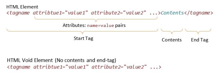
An HTML opening tag is enclosed by a pair of angle brackets in the form of <tag-name> (e.g., <p>, <title>), which is associated with a matching closing tag </tag-name> having a leading forward slash, (e.g., </p>, </title>). The tag-name shall be in lowercase.
Tag's Attributes
Attributes, in the form of name="value" pairs can be included in the opening tag to provide additional information about the element.
Example 1: In <html lang="en">, the attribute lang="en" specifies the natural language for this document.
Example 2: In <meta charset="utf-8">, the attribute charset="utf-8" specifies the character encoding scheme.
Example 3: An <img> (image) tag may contain these attributes:
<img src="logo.gif" alt="logo" width="50" height="30" >
The attribute "src" specifies the source-URL of the image; "alt" specifies an alternate text, if the image cannot be displayed; "width" and "height" specify the width and height of the image displayed area.
Some of the attributes are mandatory (e.g., the "src" and "alt" attributes of the <img> tag); while some are optional (e.g., the "width" and "height" attributes of the <img> tag, which are used by browser to reserve space for the image and resizing the image; but browser can figure out the width and height after the image is loaded).
Multiple attributes are separated by space, as follows:
<tag-name attName1="attValue1" attName2="attValue2" ...> ... </tag-name>
Attributes are written in the form of name="value" pairs. The value should be enclosed in single or double quotes for XHTML/XML compliance (although HTML5 does not enforce it).
HTML Elements
An HTML element consists of the opening and closing tags, and the content in between, e.g., <p>A for apple</p>, <strong>Caution!</strong>.
There are two types of elements:
- Container Element: A container element has an opening tag
<tag-name>that activates an effect to its content, and a matching closing tag</tag-name>to discontinue the effect. In other words, container elements apply formatting to their contents. For example:<h1>The h1 tags enclose a heading level 1</h1> <p>The p tags is used to <em>markup</em> a <strong>paragraph</strong>.</p>
- Void Element (or Standalone Element or Empty Element): A void element does not enclose content but is used to achieve a certain effect, e.g.,
<hr>is used to draw a horizontal rule;<br>to introduce a manual line-break; and<img>for embedding an external image.
In XHTML, you need to end a standalone element with a trailing'/'in the opening tag. For examples:<br /> <hr /> <img src="logo.gif" />
Alternatively, you can also close a standalone element with a matching closing tag. This is cumbersome but consistent in syntax to the container element. For example,<br></br> <hr></hr> <img src="logo.gif"></img>
HTML5 no longer enforces the above rules. Today, most developers omit the trailing'/'for brevity, e.g.,<br>,<hr>.
HTML4 has these void elements:<area>,<base>,<br>,<col>,<hr>,<img>,<input>,<link>,<meta>,<param>.
HTML5 added<command>,<keygen>,<source>.
Nesting Elements and the Document Tree
An HTML element can be nested within another element, e.g., <p>This is my <em>first</em> web page!</p>. It is important to properly nest the elements, e.g., the sequence <p>...<em>...</p>...</em> is invalid.
A valid HTML document exhibits a tree structure (called DOM or Document Object Model), with the element <html> as the root element of the document tree, with two child elements: <head> and <body>.
[TODO] Draw the DOM tree for one of the examples.
Rendering HTML Pages
Browsers follow these rules when rendering HTML documents:
- In HTML5, the tag-names are NOT case sensitive. I recommend using lowercase, as it is easier to type and XHTML compliance. (XHTML/XML is case sensitive.)
- Blanks, tabs, new-lines and carriage-returns are collectively known as white spaces. "Extra" white spaces are ignored. That is, only the first white space is recognized and displayed. For example,
<p>See   how the   extra white    spaces,
      tabs  and
    line-breaks    are   ignored  by  the
                browser.</p>
produces the following single-line output on screen with words separated by a single space:
See how the extra white spaces, tabs and line-breaks are ignored by the browser.
You need to use the paragraph tag<p>...</p>to lay out a paragraph; or insert a manual line-break tag<br>to break into a new line. In other words, you control the new-lines via the mark-up tags. The<p>...</p>leaves additional space after the paragraph; while<br>does not.
To get multiple whitespace, use a special code sequence (which stands for non-breaking space). For example,<p>This is a paragraph.</p> <p>Another paragraph<br>with a line-break in between and more spaces before this.</p>
This is a paragraph.
Another paragraph
with a line-break in between and more spaces before this.
The Basic Document Skeleton
The <html> Element and its Child Elements <head> and <body>
An HTML document has the following skeleton:
<!DOCTYPE html>
<html>
  <head>...</head>
  <body>...</body>
</html>
The <html>...</html> container element defines the extent of an HTML document.
There are two sections: HEAD and BODY:
- <head>...</head> container element defines the
HEADsection, which contains descriptions and meta-information of the HTML document. Browsers interpret these descriptions to properly display the body content. - <body>...</body> container element defines the
BODYsection, which encloses the content that users actually see in the browser's window.
The HEAD Section and the <title>, <meta>, <link>, <script> Elements
The HEAD section may contain these elements: <title>, <meta>, <link>, <script>, <base>.
The <title>...</title> container element encloses the title for the page. You should use a meaningful title because:
- The title shows up at the title-bar of the browser window.
- The title shows up in bookmarks and history lists (the URL is stored if there is no title).
- Titles are used by search engines to index your page.
The <title> element is mandatory in HTML5.
The <meta> element contains meta-information, for use by browser to properly render the document. For example, <meta charset="utf-8"> specifies the character encoding scheme for the document.
You can use a <link> element to add an external CSS Style Sheet (and <style>...</style> element for internal styles):
<link href="filename.css" rel="stylesheet">
Note: HTML4/XHTML1 require an additional attribute type="text/css" in the <link> tag.
You can use a <script>...</style> element to define programming scripts. For example, to add an external JavaScript file:
<script src="filename.js"></script>
Note: HTML4/XHTML1 require an additional attribute language="JavaScript" in the <script> tag. Also take note that the closing </script> tag is needed, even though there is no content within <script> and </script>. We usually place the JavaScript after CSS, as the JavaScript may use the CSS.
The <body> Element
The <body>...</body> element defines the BODY section of an HTML document, which encloses the content to be displayed on the browser's window.
The <body> tag has the following optional presentation attributes. All of these presentation attributes are concerned about the appearance instead of the content, and have been deprecated in HTML 4 in favor of style sheet. However, many older textbooks present them in Chapter 1. Hence, I shall list them here for completeness. BUT do not use these attributes. I shall describe how to control the appearance of <body> using CSS very soon.
- text="color": color of body text.
- bgcolor="color": background color.
- background="url": URL of an image to be used as the background.
- link="color": color of un-visited links.
- vlink="color": color of visited links.
- alink="color": color of active (clicked) links.
For example:
<html>
<body text="blue" bgcolor="lightblue" link="green" vlink="red" alink="yellow">
  <p>Hello</p>
  <a href="http://www.google.com">Google</a>
</body>
</html>
The foreground color (of the texts) is "blue", on background color of "lightblue". You can set different colors for the three types of links via attributes "link" (for un-visited links), "vlink" (for visited links), and "alink" (for active link - the "alink" color shows up when you click on the link).
HTML Comment <!-- ... -->
HTML comments are enclosed between <!-- and -->. Comments are ignored by the browser. You
need to look into the HTML codes (via "View Source" or "View Page Source") to read them. Comments are extremely important in programming to explain and document a section of programming codes and logic. HTML documents are textual and self-explanatory, comments are less important (but still nice to have) to describe the various part of the documents.
Comments are also useful in temporarily disable a certain part of the HTML codes during development.
You can comment out an entire elements, e.g.,
<!--
<h1>hello, world</h1>
-->
But you cannot place comment inside a tag, e.g.,
<h1 <!-- invalid comment -->>hello, world</h1>
Block Elements vs. Inline Elements
Elements can be classified as:
- Block Elements: A block element (such as
<p>,<h1>to<h6>and<div>) starts on a new line, takes the full width, and ends with a new line. It is rectangular in shape with a line-break before and after the element. - Inline Elements (or Character Elements): An inline element (such as
<em>,<strong>,<code>and<span>) takes up as much space as it needs. It does not force a line-break before and after the element, although it can span a few lines.
In brief, a block element is always rectangular in shape, while an inline element spans a continuous run of characters.
Block Elements
Paragraph <p>...</p>
Function: When the browser reads a <p> tag, it breaks to a new line, and skips some white spaces. For example,
<p>This is a paragraph of texts.</p>
Older HTML documents often omit the closing </p>, which is a bad practice, not recommended, and disallowed in XML/XHTML.
To create an empty paragraph, you need to use <p> </p> which encloses a non-breaking space. This is because browsers typically ignore <p></p>.
Line Break <br> (Standalone)
Function: Instruct the browser to break to a new line, without skipping white spaces as in <p>. Note that the line breaks in the HTML codes are treated as white spaces and do not translate to new lines in the display. Hence, you have to insert the <br> manually. For example,
<p>This
paragraph<br>with a
line-break
in between.</p>
This
paragraph
with a
line-break
in between.
Heading Level 1 to 6 <h1>...</h1> to <h6>...</h6>
Function: Establish six levels of document headings. <h1> is the highest (with the largest font size) and <h6> is the lower. Headings are usually displayed in bold, have extra white spaces above and below. For example,
<h1>This is Heading Level 1</h1>
<h2>This is Heading Level 2</h2>
<h3>This is Heading Level 3</h3>
<h4>This is Heading Level 4</h4>
<h5>This is Heading Level 5</h5>
<h6>This is Heading Level 6</h6>
<p>This is a paragraph</p>
Horizontal Rule <hr> (Standalone)
Function: Draw a horizontal line (or rule). By default, the rule is full width (100%) across the screen, 1 point in size, and has a shading effect for a 3D appearance. For example,
<h1>Heading</h1>
<hr>
<p>Discussion begins here...</p>
Pre-Formatted Text <pre>...</pre>
Function: Texts enclosed between <pre>...</pre> container tags are treated as pre-formatted, i.e., white space, tabs, new-line will be preserved and not ignored. The text is usually displayed in a fixed-width (or monospace) font. <pre>...</pre> is mainly used to display program codes. For example, my favorite Java's "Hello-world":
<pre>public class Hello {
   public static void main(String[] args) {
      System.out.println("Hello");
   }
}</pre>
public class Hello {
   public static void main(String[] args) {
      System.out.println("Hello");
   }
}
Without the <pre> tag, the entire program will be shown in one single line.
Quote <blockquote>...</blockquote>
Function: Mark out a block of quote. Browsers typically indent the entire block to the right. For example,
<blockquote>Lorem ipsum dolor sit amet, consectetur adipisicing elit,
sed do eiusmod tempor incididunt ut labore et dolore magna aliqua.
Ut enim ad minim veniam, quis nostrud exercitation ullamco laboris nisi
ut aliquip ex ea commodo consequat. Duis aute irure dolor in
reprehenderit in voluptate velit esse cillum dolore eu fugiat nulla pariatur.
 Excepteur sint occaecat cupidatat non proident, sunt in culpa qui
officia deserunt mollit anim id est laborum.</blockquote>
Division <div>...</div> and Span <span>...</span>
The <div> block elements, together with its inline counterpart <span>, are extensively used in the modern web pages to mark out a rectangular block or inline span of text. The <div> and <span>, by itself, does not do anything. Unlike elements such as <h1>, <p> and <strong>, which possess certain visual properties, <div> and <span> do not have any inherent visual properties. They are simply markers and to be used together with CSS for applying custom formatting style. We shall describe them later in the CSS section.
Best Practices:
- Notes: With the introduction of many new semantic block elements in HTML5, such as
<header>,<footer>,<main>,<section>, it is strongly encouraged "to view the<div>element as an element of last resort, for when no other element is suitable. The use of more appropriate elements instead of the<div>element leads to better accessibility for readers and easier maintainability for authors". - Avoid deep nested container layouts using
<div>. "should be not nested deeper than 6 layers". - Use as little HTML elements as possible (to increase the content to tag ratio and reduce page load).
HTML5's New Semantic Block Elements
Before HTML5, we rely on the all-purpose generic container <div> elements to structure a document into various sections and apply the formatting style, For example,
<div class="header">
  ......
</div>

<div class="content">
  ......
</div>

<div class="footer">
  ......
</div>
This is less than desirable, as <div> elements do not provide semantic information about the sections.
HTML5 added many semantic block elements, which extends <div> to structure a document. They are: <header>, <footer>, <nav>, <section>, <article>, <summary>, <details>, <aside>, <figure>, <figcaption>, and <main>. You are encouraged to replace some of the <div>'s with these more descriptive semantic elements. Nonetheless, it is important to note that NOT all browsers (notably older IE versions) support these new elements.
Header <header>...</header>, Footer <footer>...</footer> and Section <section>...</section>
The <header>...</header> and <footer>...</footer> elements can be used to markup the header and footer of a web page, in place of the less semantic pre-HTML5 <div id|class="header"|"footer">.
The <section>...</section> element can be used to markup each content section in a document (such as each chapter of the book). (HTML5 does not define a <content> element!) For example,
<header>
  ......
</header>

<section>
  ......
</section>

<section>
  ......
</section>

<footer>
  ......
</footer>
Article <article>...</article>
The <article>...</article> element is used to markup an independent and self-contained article such as a news story, which could have its own header, footer and content sections.
Figure <figure>...</figure> and Figure Caption <figcaption>...</figcaption>
You can markup a figure via <figure>...</figure> and <figcaption>...</figcaption>, e.g.,
<figure>
   <img src="...." alt="...">
   <figcaption>......</figcaption>
</figure>
You can remove the alt attribute from the <img> tag, as <figcaption> typically provides better description.
In a web page, figures are typically float alongside the text. For example, you can apply the following style rules to <figure> and <figcaption> to float the figure to the left:
figure {
  float: left;
  margin-left: 0px;
  margin-top: 0px;
  margin-right: 20px;
  margin-bottom: 0px;
}

figcaption {
  font-size: small;
  font-style: italic;
  margin-bottom: 5px;
}
Sidebar <aside>...</aside>
The <aside> element can be used to introduce related contents, typically formatted in a floating sidebar alongside the main texts.
Navigation Menu <nav>...</nav>
The <nav>...</nav> element wraps a set of links into a navigation menu. For example,
<nav>
  <h1>....</h1>
  <ul>
    <li><a href="...">......</a></li>
    <li><a href="...">......</a></li>
    ......
  </ul>
</nav>
You can place the <nav> under an <aside> if the navigation menu is to be shown in a sidebar (or side panel).
Which Element to Use?
The HTML5 Doctor provides a nice flowchart for you to decide which HTML5 element to use @ http://html5doctor.com/downloads/h5d-sectioning-flowchart.pdf.
Summary <summary>...</summary> and Details <details>...</details>
The <summary> and <details> elements are meant for showing the summary and details, typically in a collapsible box. You can use the following JavaScript to show/hide the box:
var box = document.getElementByID("...");
// Hide the box
box.style.display = "none";
// Show the box
box.style.display = "block";
However, the browser supports for these two tags are poor, and it is best to avoid them.
Main Content <main>...</main>
The <main> element (introduced in HTML5.1) marks the main content of a web page, excluding the header, footer, and navigation menu. There shall NOT be more than one <main> element in a document. For example,
<header>......</header>

<main>
  <article>......</article>
    <section>......</section>
    <section>......</section>
  <article>.......</article>
</main>

<footer>......</footer>
The <main> element shall NOT be a descendant of an <article>, <aside>, <footer>, <header>, or <nav> tags.
Providing Backward-Compatibility
Chrome, Firefox, Safari and Opera have no problems with these HTML5 tags, so does IE (Internet Explorer) 10. However, IE 9 and IE 8 may have problems rendering these tags.
To provide compatibility to older browsers, you could:
- Add a CSS rule to render these tags as block element (does not work for IE 8):
article, aside, figure, figcaption, footer, header, main, nav, section, summary { display: block; } - Use the HTML5 Shiv (@ https://github.com/afarkas/html5shiv), which contains JavaScript to create these elements.
- Use Modernizr (@ http://modernizr.com/) - a JavaScript library that detects HTML5/CSS3 features.
Inline Elements - Logical Style vs. Physical Style
Logical-style formatting tags specify the semantic meaning (e.g., strong, emphasis, code); whereas physical-style formatting tags define the physical or typographical appearance (e.g., bold, italic, teletype). Logical styles should be used instead of physical styles. This is because physical styles deal with the appearance, which should be defined in style sheet, so as to separate the content and presentation.
Logical-Style Formatting Tags
The logical style character-level (inline) tags are:
| Logical-Style Tag | Meaning |
|---|---|
<mark>...</mark> (HTML 5) |
Highlight |
<strong>...</strong> |
strong emphasis (bold) |
<em>...</em> |
emphasis (italic) |
<code>...</code> |
program code (fixed-width monospace font) |
<q>...</q> |
quotation (enclosed in curly double quotes) |
<ins>...</ins> |
inserted |
<del>...</del> |
deleted |
<def>...</def> |
definition (bold or bold-italic) |
<cite>...</cite> |
citation (italic) |
<kbd>...</kbd> |
Keyboard (fixed-width monospace font) |
<samp>...</samp> |
sample text (fixed-width monospace font) |
<abbr>...</abbr> |
abbreviation (dotted underline, with title as tool tip) |
<acronym>...</acronym> |
acronym (dotted underline, with title as tool tip). Recommend using <abbr> instead. |
<address>...</address> |
address |
<var>...</var> |
variable (fixed-width or italic) |
The commonly-used tags are: <strong> (displayed in bold), <em> (displayed in italics), and <code> (use monospace font for programming codes).
Example:
<p>Lorem <q>curly quoted</q>, consectetur adipisicing elit,
sed do <cite>citation</cite> incididunt ut labore et dolore magna aliqua.
Ut enim ad minim veniam, quis <samp>sample</samp> exercitation ullamco laboris nisi
ut <code>code</code> ex ea <kbd>keyboard</kbd> consequat. Duis aute irure dolor in
reprehenderit in velit esse cillum dolore eu fugiat nulla pariatur.
Excepteur <ins>insert</ins> occaecat <del>delete</del> non proident,
sunt in culpa qui officia deserunt mollit anim id est laborum.</p>
Lorem curly quoted
, consectetur adipisicing elit,
sed do citation incididunt ut labore et dolore magna aliqua.
Ut enim ad minim veniam, quis sample exercitation ullamco laboris nisi
ut code ex ea keyboard consequat. Duis aute irure dolor in
reprehenderit in velit esse cillum dolore eu fugiat nulla pariatur.
Excepteur insert occaecat delete non proident,
sunt in culpa qui officia deserunt mollit anim id est laborum.
<abbr> and <acronym>
The contents are shown with a dotted underline. By including an attribute title="fulltext" to the <abbr> and <acronym> opening tag, the full text will be shown as tool tip, when you point your mouse pointer to the element. HTML5 supports <abbr>, but does not support <acronym>.
For example,
<p>Lorem <abbr title="abbreviation">abbr</abbr> dolor sit amet, consectetur adipisicing elit,
sed do eiusmod tempor <acronym title="Hypertext Markup Language">HTML</acronym> ut labore
et dolore magna aliqua.</p>
Lorem abbr dolor sit amet, consectetur adipisicing elit, sed do eiusmod tempor HTML ut labore et dolore magna aliqua.
The title="tooltip-text" attribute is actually applicable to almost all of the HTML tags (e.g., <p>, <h1> to <h6>, <img>).
Physical-Style Formatting Tags
All the physical-style character-level tags are deprecated in HTML 4, as they deals with presentation and should be done via CSS. I list them here for completeness, in case you need to read some old HTML codes.
However, theHTML5 restores the <b>, <i>, <small>, <sup>, <sub>, <u> tags. The <big>, <tt> remains unsupported.
| Physical-Style Tag | Meaning |
|---|---|
<b>...</b> |
bold |
<i>...</i> |
italic |
<u>...</u> |
underline (deprecated in HTML 4, but reinstated in HTML 5) |
<big>...</big> |
large font |
<small>...</small> |
small font |
<sup>...</sup> |
superscript |
<sub>...</sub> |
subscript |
<tt>...</tt> |
teletype (typewriter, in monospace font) |
Span <span>...</span>
Similar to its block-level counterpart <div>, <span> elements are extensively used in the modern web pages to mark out a run of texts, primarily for applying style.
HTML5's New Semantic Inline Elements
HTML5 puts back the <b>, <i> and <small> elements (that were deprecated in HTML4/XHTML1), but not the <u> element. It also added more semantic character-level elements for text: <mark>, <time>, <wbr>. These elements are hardly used due to poor browser support, but presented here for completeness.
DateTime <time>
For marking up date, time, or datetime.
Word Break <wbr>
[TODO]
Marked Text <mark>
Highlighting certain texts, such as keywords. By default, it is shown with bright yellow background, similar to highlighter's marking.
Entity References for Reserved & Special Characters
HTML uses characters such as <, >, ", & as markup tags' delimiters. Hence, these characters are reversed and cannot be used in the text directly. An escape sequence (called entity reference), in the form of &xxx; (begins with & and ends with ; and contain the code xxx) is used for these reserved characters and other special characters. The commonly used entity references are as follows (there are many many more, refer to the HTML reference - I like the arrows, Greek symbols, and the mathematical notations). Entity reference is case sensitive.
| Character | Entity Reference |
|---|---|
| " (NOT really needed!) | " |
| < | < |
| > | > |
| & | & |
| non-breaking space | |
| → ⇒ ↔ ⇔ | → ⇒ ↔ ⇔ |
| ° (degree) | ° |
| © ® € ¢ ¥ | © ® € ¢ ¥ |
| ˜ | ˜ |
| × ± ∞ | × ± ∞ |
| π Π σ Σ ω Ω | π Π σ Σ ω Ω |
| ≥ ≤ ≡ ≈ | ≥ ≤ ≡ ≈ |
| ⊂ ⊃ ⊆ ⊇ ∈ | ⊂ ⊃ ⊆ ⊇ ∈ |
| ☎ | ☎ |
| 🔍 (search) | 🔍 |
| ✓ ✗ | ✓ ✗ |
You need to memorize the first five which are extensively used: " ("), < (<), > (>), & (&) and ( ).
Double Quote (" or ")
I used to replace double quote (") with entity reference " but there is actually no such need. Even if you need to use double quote in an attribute value, you could write alt='say "hello"' with single quote as delimiter. I recommend NOT using " for brevity.
Non-breaking Space ( )
As mentioned earlier, browsers ignore extra whitespaces (blanks, tabs, newlines). That is, multiple whitespaces are treated as one single whitespace. You need to use the non-breaking spaces ( ) to insert multiple whitespaces.
Example:
<p>This paragraph contains special character " <, > and & and those words have more spaces in between.</p>
This paragraph contains special character " <, > and & and those words have more spaces in between.
Lists
List-related tags are meant for marking up a list of items. HTML supports three types of lists: ordered list, unordered list and definition list.
Unordered List <ul>...</ul> and List Item <li>...</li>
Function: An unordered list is shown with a bullet in front of each item. The <ul>...</ul> contains an unordered list. Each of items in the list is enclosed in <li>...</li>, as follow:
<ul>
  <li>list-item-1</li>
  <li>list-item-2</li>
  ......
</ul>
Example:
<p>An OMO web designer must master:</p>
<ul>
   <li>Hypertext Markup Language (HTML)</li>
   <li>Cascading Style Sheet (CSS)</li>
   <li>HyperText Transfer Protocol (HTTP)</li>
   <li>Apache HTTP Server</li>
</ul>
Output of the example:
- Hypertext Markup Language (HTML)
- Cascading Style Sheet (CSS)
- HyperText Transfer Protocol (HTTP)
- Apache HTTP Server
You can use attribute type in <ul> tag to choose the style of the bullets:
- type="disc": a black dot (default).
- type="circle": an empty circle.
- type="square": a filled square.
Ordered List <ol>...</ol> and List Item <li>...</li>
Items in an ordered list are numbered automatically by the browser. The container tag <ol>...</ol> contains an ordered list. Each item of the list is contained inside a <li>...</li> container tag. The syntax is similar to the unordered list.
You can use attribute start="number" in the <ol> tag to specify the starting number (which default to 1).
You can use the type attribute of the <ol> tag to choose the numbering style:
- type="1": numbers 1, 2, 3, ... (default)
- type="a": lowercase letters a, b, c, ...
- type="A": uppercase letters A, B, C, ...
- type="i": lowercase Roman numerals i, ii, iii, iv, ...
- type="I": uppercase Roman numerals I, II, III, IV, ...
Definition List (or Description List) <dl>...</dl>, Definition Term <dt>...</dt> and Definition Detail <dd>...</dd>
Function: <dl>...</dl> tag contains a Definition List. Each of <dt>...</dt> and <dd>...</dd> pair contains a Definition Term and the Definition Detail. HTML 5 call it Description List.
<dl>
  <dt>term-1</dt>
  <dd>definition-for-term-1</dd>
  <dt>term-2</dt>
  <dd>definition-for-term-2</dd>
  ......
</dl>
Example:
<p>These are some of the commonly-encountered web protocols:</p>
<dl>
   <dt>HTTP</dt><dd>HyperText Transfer Protocol</dd>
   <dt>FTP</dt><dd>File Transfer Protocol</dd>
   <dt>SMTP</dt><dd>Simple Mail Transfer Protocol</dd>
   <dt>POP</dt><dd>Post Office Protocol</dd>
</dl>
These are some of the commonly-encountered web protocols:
- HTTP
- HyperText Transfer Protocol
- FTP
- File Transfer Protocol
- SMTP
- Simple Mail Transfer Protocol
- POP
- Post Office Protocol
The "unordered list" and "ordered list" are used in most of the HTML documents. But I don't find many web pages using the "definition list".
Nested Lists
You can place a list inside another list (called nested lists), by writing a complete list definition under an <li> item of the outer list. You can nest any types of lists (ordered list, unordered list).
Example 1:
<p>The topics covered are:</p>
<ul>
  <li>HyperText Markup Language (HTML)
    <ul>
      <li>Based on SGML</li>
      <li>Used to create web pages</li>
      <li>Maintained by W3C</li>
    </ul>
  </li>
  <li>Cascading Style Sheet (CSS)
    <ul>
      <li>Used to define presentation style for web pages</li>
      <li>Also maintained by W3C</li>
    </ul>
  </li>
</ul>
Output of Example 1:
- HyperText Markup Language (HTML)
- A markup language based on SGML
- Used to create web pages
- Maintained by W3C
- Cascading Style Sheet (CSS)
- Used to define presentation style for web pages
- Also maintained by W3C
Example 2:
<ol>
  <li>XML: Extensible Markup Language
    <ol>
      <li>Based on SGML</li>
      <li>Maintained by W3C</li>
    </ol>
  </li>
  <li>DOM: Document Object Model</li>
  <li>SAX: Simple API for XML</li>
</ol>
Output of Example 2:
- XML: Extensible Markup Language
- Based on SGML
- Maintained by W3C
- DOM: Document Object Model
- SAX: Simple API for XML
Tables
Table-related tags are meant for tabulating data. (Older HTML documents tend to use <table> for formatting the document to divide the document into columns/sections, which should be avoided. Use style sheet for formatting instead.)
The basic unit of a table is a cell. Cells are grouped into row. Rows are grouped to form the table. This corresponds well to the "row-centric" approach in the display.
The essential tags used by table are:
- <table>...</table>: contains the entire table.
- <tr>...</tr>: contains a row.
- <th>...</th> and <td>...</td>: contain a header cell and a data (detail) cell respectively.
Additional tags are:
- <caption>...</caption>: specifies a caption.
- <thead>...</thead>, <tbody>...</tbody>, and <tfoot>...</tfoot>: for marking out the table header, body and footer.
- <colgroup>...</colgroup> and <col>...</col>: for applying styles to column group and column respectively.
For Example:
<table>
  <caption>Price List</caption>
  <tr>
    <th>Fruit</th>
    <th>Price</th>
  </tr>
  <tr>
    <td>Apple</td>
    <td>$0.50</td>
  </tr>
  <tr>
    <td>Orange</td>
    <td>$0.65</td>
  </tr>
</table>
| Fruit | Price |
|---|---|
| Apple | $0.50 |
| Orange | $0.65 |
Table <table>...</table>
Function: Set up a table, consisting of rows of cells.
Three optional presentation attributes, border="n" (specifies the width of borders, in pixels), cellspacing="n" (specifies the spacing between cells, in pixels), and cellpadding="n" (define the spacing between the content of the cell and its boundaries, in pixels), are often used in older HTML pages but now deprecated. The now-preferred approach is to use CSS (again! but coming soon!).
Table Row <tr>...</tr>
Function: Set up a row inside a table, consisting of cells.
Table Header Cell <th>...</th>, Table Data Cell <td>...</td>
Function: Set up each individual cell of a row (of a table). <th>...</th> defines a header cell (usually displayed in bold with center alignment) and <td>...</td> defines a body cell.
An empty cell is typically marked as <td> </td>.
Cell Span: Attributes "rowspan" and "colspan"
On a <td> or <th> cell, we can use the attribute rowspan="numOfRows" or colspan="numOfColumns" to span the cell to occupy multiple rows or columns. The subsequent <td> or <th> cells will adjust their positions accordingly.
Example 1:
<table>
  <tr>
    <td>11111</td>
    <td>22222</td>
    <td>33333</td>
  </tr>
  <tr>
    <td>44444</td>
    <td rowspan="2">55555</td>
    <td>66666</td>
  </tr>
  <tr>
    <td>77777</td>
    <td>88888</td>
  </tr>
</table>
| 11111 | 22222 | 33333 |
| 44444 | 55555 | 66666 |
| 77777 | 88888 |
Example 2:
<table>
  <tr>
    <td colspan="2" rowspan="2">11111</td>
    <td>22222</td>
  </tr>
  <tr>
    <td>33333</td>
  </tr>
  <tr>
    <td>44444</td>
    <td>55555</td>
    <td>66666</td>
  </tr>
</table>
| 11111 | 22222 | |
| 33333 | ||
| 44444 | 55555 | 66666 |
Table Header <thead>...</thead>, Table Body <tbody>...</tbody> and Table Footer <tfoot>...</tfoot>
Function: Used to define a header, body and footer sections for a table. Browser may duplicate the header or footer when breaking the table across multiple pages (in print-out). They can also be used to apply styles to each of the sections.
Column Group <colgroup>...</colgroup> and Column <col>
An HTML table is row-centric. It consists of rows of cells. Nonetheless, you can also identify the columns via <colgroup> or <col>. But the features are really limited. Only a few properties could be applied on columns: border, background, width, visibility and display.
Function: <colgroup>...</colgroup> can be used to group a set of columns, so that styles can be applied to all the columns in the group. Similarly, <col> can be used to identify a column for applying styles.
The attribute span="numOfColumns" specifies the number of columns belonging to this <colgroup> or <col> declaration.
A <col> not nested under <colgroup> is automatically wrap under a <colgroup>.
Example 1:
<table>
  <!-- col group 1 spans 3 columns -->
  <colgroup span="3" style="background-color:lightgrey"></colgroup>
  <!-- col group 2 spans 1 columns -->
  <colgroup span="1"></colgroup>
  <tr>
    <td>Col 1 is in the group</td>
    <td>Col 2 is in the group</td>
    <td>Col 3 is in the group</td>
    <td>Col 4 is NOT in the group</td>
  </tr>
  <tr>
    <td>Col 1 is in the group</td>
    <td>Col 2 is in the group</td>
    <td>Col 3 is in the group</td>
    <td>Col 4 is NOT in the group</td>
  </tr>
</table>
| Col 1 is in the group | Col 2 is in the group | Col 3 is in the group | Col 4 is NOT in the group |
| Col 1 is in the group | Col 2 is in the group | Col 3 is in the group | Col 4 is NOT in the group |
Example 2:
<table>
  <!--  colgroup 1 consists of col 1 and col 2 -->
  <colgroup>
    <col style="background-color:lightyellow" />
    <col style="background-color:white"  />
  </colgroup>
  <!--  colgroup 2 consists of col 3 and col 4 -->
  <colgroup style="background-color:lightgrey" >
    <col span="2" />
  </colgroup>
  <tr>
    <td>Col 1 in the group 1</td>
    <td>Col 2 in the group 1</td>
    <td>Col 3 in the group 2</td>
    <td>Col 4 in the group 2</td>
  </tr>
  <tr>
    <td>Col 1 in the group 1</td>
    <td>Col 2 in the group 1</td>
    <td>Col 3 in the group 2</td>
    <td>Col 4 in the group 2</td>
  </tr>
</table>
| Col 1 in the group 1 | Col 2 in the group 1 | Col 3 in the group 2 | Col 4 in the group 2 |
| Col 1 in the group 1 | Col 2 in the group 1 | Col 3 in the group 2 | Col 4 in the group 2 |
Read "A Complete Guide to the Table Element" @ https://css-tricks.com/complete-guide-table-element/.
Anchors and Hyperlinks
A hypertext-link (or hyperlink, or link) allows users to:
- navigate to a different document.
- navigate to an "Anchor Point" (or bookmark) in the current document or another document, or
- request other web resources (such as e-mail).
The anchor element <a>...</a> can perform one of these two functions:
- It can be used to set up a hyperlink, where user can navigate to the target document by clicking the link.
- It can also be used to set up a "named anchor point" (or bookmark) within a document, to be targeted by other hyperlinks. This function is hardly used, as we nowadays use the
idattributes as targets.
Setting up a Hyperlink <a href="url">...</a>
Function: to set up a hyperlink pointing to the url in "href" (hypertext reference) attribute.
Examples:
<a href="http://www.w3c.org">W3C Home Page</a>
<a href="ftp://ftp.faqs.org">FTP to FAQS.ORG</a>
Show <a href="../images/logo.gif">LOGO</a>Image
<a href="mailto:help@zzz.com">Email Help</a>
<a href="news:soc.culture.singapore">Singapore News</a>
Link's Target Window/Frame <a href="url" target="...">...</a>
Instead of displaying the targeted page pointed to by href in the current browser's window. You can use the attribute target="targetName" to display the new page in another window.
- target="_blank": opens the linked document in a new tab or window. Take note that some people consider this as annoying and disruptive (hence, it was deprecated in HTML4.01, but supported in HTML5).
- target="_self" (default): opens the linked document in the same window/frame.
- target="_parent": opens the linked document in the parent frame.
- target="_top": opens the linked document in the full body of the window.
- target="frame-name": opens the linked document in the named frame.
[Note: The target attribute has been deprecated in HTML 4.01 and XHTML 1.0. But it seems to be back in HTML5.]
Setting up a Link Targeting a Specific HTML Element via the id Attribute
You can setup a link to target a specific HTML element (typically a heading <h1> to <h6>), similar to bookmark, via:
- Define an
id="idName"attribute for the targeted element. Theidattribute is applicable to ALL HTML elements, including<h1>to<h6>. Theid-value is supposed to be unique in the document (i.e., no two elements shall have the sameid-value). An anchor name (or bookmark) calledidnamewill be set up automatically on the element. You can refer to the anchor point via#idName, by prefixing with a#sign. - Setup a link targeting the anchor point, i.e.,
<a href="#idName">...</a>for the same document, or<a href="url#idName">...</a>for the anchor point in another document identified viaurl.
For example,
<h1 id="ch1">Chapter 1</h1>
  ......
  ......
<h1 id="ch2">Chapter 2</h1>
  ......
  ......
Jump to <a href="#ch1">Chapter 1</a>
  ......
Jump to <a href="#ch2">Chapter 2</a>
URLs (Uniform Resource Locators)
A URL uniquely identifies a piece of resource over the Internet. A URL is made up of 4 parts as follows:
protocol://hostname:port/path_and_filename
- Protocol: e.g.,
http,ftp,mailto,file,telnetand others. - Server's domain name (e.g., www.w3c.org) or IP address (e.g., 127.0.0.1). The DNS (Domain Name Service) translates a domain name to an IP address.
- Port number (optional): the TCP port number on which the server application is running. The default TCP port number is used if port number is omitted from the URL. For example, default TCP port number 80 will be used for HTTP, 21 for FTP.
- Directory path and file name: Unix-style forward-slash
'/'is used as the path separator (instead of Windows-style back-slash'\'). Directory path and filename of the URL are case sensitive.
Examples of URLs are:
http://www.w3c.org/css/index.html
http://www.mytest.com:8080/default.html
ftp://ftp.faqs.org
news:soc.culture.singapore
mailto:help@zzz.com
javascript:myFunction()  //See example below
Absolute vs. Relative URLs
An absolute URL is fully qualified, e.g., http://www.mytest.com/abc/index.html. A relative URL is relative to a base URL.
For example, suppose that the base URL is http://www.mytest.com/abc/index.html, the base path (excluding the filename) is http://www.mytest.com/abc/.
- The relative URL "
test.html" refers tohttp://www.mytest.com/abc/test.html.". - The relative URL "
../home.html" refers tohttp://www.mytest.com/home.html, where the double dot ".." denotes the parent directory, and single dot "." refers to the current directory.
Rule of Thumb: Always use relative URLs for referencing documents in the same server for portability (i.e., when you move from a test server to a production server). Use absolute URLs only for referencing resources from a different server.
Internal Links vs. External Links
Internal links points to resources in the same website (including anchor point in the current page). External links point to another website.
It is important to use relative URL for all the internal links.
Link Checker
You can use the W3C Online Link Checker (@ http://validator.w3.org/checklink) to check all the links in your document.
Authoring tools like DreamWeaver also provide built-in Link Checker.
Defining a Named Anchor <a name="anchorName">...</a> (Not Supported in HTML5)
In HTML 4.01, you can use the name="anchorName" attribute of the <a> tag to define a named anchor, which can then be targeted via #anchorName. This is similar to the implicit anchor name setup via the id attribute described earlier. The <a>'s name attribute is not supported in HTML5, preferring the simpler id attribute.
For example,
<h2><a name="eg_1">Example 1</a></h2>
  ......
  ......
<h2><a name="eg_2">Example 2</a></h2>
  ......
  ......
Jump to <a href="#eg_1">Example 1</a>
  ......
Jump to <a href="#eg_2">Example 2</a>
Links that Invoke JavaScript
You can use protocol javascript: to invoke JavaScript, e.g.,
<!DOCTYPE html>
<html lang="en">
<head>
<meta charset="utf-8" />
<title>HTML Testing</title>
<script>
function myFunction() {
  alert("hello, world")
}
</script>
</head>
<body>
<a href="javascript:myFunction()">Run JavaScript</a>
</body>
</html>
The is the same as:
<a href="#" onclick="myFunction(); return false">Run JavaScript</a>
The "return false" is needed to prevent the page from scrolling to the top following href="#".
The inline JavaScript is hard to maintain, and hence, not recommended.
Images
<img> Image Tag (Void Element)
Function: Embed an image inside an HTML document. The syntax is:
<img src="imageUrl"
  alt="alternate-text-if-image-cannot-be-shown"
  width="pixels|n%"
  height="pixels|n%"
  title="tooltip-text">
Example:
<img src="logo.gif" alt="Logo" title="Logo" width="200" height="100">
Attributes:
- src="imageUrl" (required): gives the URL of the image.
- alt="text" (required): alternative text to be displayed if the image cannot be displayed.
- width="n|n%", height="n|n%": specify the width and height of the image display area (in pixels or percentage). Browsers use these values to reserve space for the image (before the image is downloaded) and continue rendering the rest of the contents. You can also use the width and height to scale an image. This is not recommended because scaling-up results in a blur image and scaling-down is a waste of bandwidth.
I recommend that you use thewidthandheighttags for images, so that the browser can reserve spaces for the images. This is more efficient and could avoid a jerky display if you page contains many images. You can find out the width and height of an image easily by checking the "Properties" of the image. - title="tooltip-text": the attribute
titleis applicable to most of the HTML elements for you to provide the tool-tip text.
Many attributes were added in HTML5. Some of them will be discussed in the later sections.
- crossorigin="anonymous|use-credentials":
- referrerpolicy="no-referrer|no-referrer-when-downgrade|origin|origin-when-cross-origin|same-origin|strict-origin|strict-origin-when-cross-origin|unsafe-url":
- decoding="sync|async|auto":
- fetchpriority="high|low|auto":
- loading="eager|lazy":
- sizes=list:
- srcset=list:
The following attributes were deprecated in HTML5: align="top|middle|bottom|left|right", border, hspace|vspace, longdesc, name.
Using Image as Hyperlink
To use an image as a hyperlink, put the image tag <img> between <a href="url"> and </a>. For example:
<a href="http://abc.com/">
  <img src="logo.gif" alt="logo" width="30" height="20">
</a>
<p>click the above image to visit us</p>
Image used as hyperlink anchor automatically gets a border. The color of the border is given in the link (unvisited), vlink (visited), alink (active) attributes of the <body> tag (or the a:link, a:visited, a:hover, and a:active CSS properties - to be discussed later).
Introduction to CSS
Why Style Sheet?
The original aim of HTML is to let the content providers concentrate on the contents of the document and leave the appearance to be handled by the browsers. Authors markup the document contents using markup tags (such as <p>, <h1>, <ul>, <table>, <img>) to indicate its semantic meaning ("This is a paragraph", "This is heading Level 1", "This is an unordered list", "This is a table", "This is an image"). The browsers then decide on how to display or present the contents in the browser's window for the web surfers.
However, HTML has gone out-of-control in the early years. Many markup tags and attributes were created for marking the appearance and the display styles (e.g., <font>, <center>, align, color, bgcolor, link, alink, vlink are concerned about the appearance in font, color and alignment) rather than the meaning of the contents. These tags flood the document and make creation and maintenance of the contents extremely difficult. Furthermore, over the years, we have engaged graphic designers to work on the appearance and leave the content providers to focus on the contents. Hence, there is a need to separate the contents and presentation of the HTML document.
The W3C (World-Wide Web Consortium @ www.w3c.org) responded to the need of separating document's contents and presentation by introducing a Style Sheet Language called CSS (Cascading Style Sheet) for presentation, and removing the presentation tags and attributes from HTML. CSS can be viewed as a companion of HTML. It allows web graphic designers to spice up the web pages, so that the content providers can focus on the document contents with HTML.
CSS Specifications
W3C defines three CSS levels:
- CSS Level 1 (December 1996): CSS1 laid the ground work and introduced the selectors and most of the properties.
- CSS Level 2 (May 1998) and CSS Level 2.1 (Last revised on June 2011): CSS2 added new features such as targeting devices and printers, and absolute positioning. CSS2.1 (@ http://www.w3.org/TR/CSS2/) touches up CSS2.
- CSS Level 3: CSS3 is not a single piece of specification. As CSS grows, W3C decided to break it into modules, such as the Selectors module, the Values and Units Modules, the Box Alignment module, and so on. Each module is then developed independently. The CSS3 Selectors module (@ http://www.w3.org/TR/selectors/) and CSS3 Colors module (@ http://www.w3.org/TR/css3-color/) were completed in 2011. Other modules are still work-in-progress.
It is important to take note that:
- CSS is humongous!!! Most of the browsers today have yet to fully support CSS2/CSS2.1.
- CSS is a language with its own syntax, which is different from HTML and JavaScript.
What is a Style Sheet?
A Style Sheet is a collection of style rules that can be applied to a selected set of HTML elements. A style rule is used to control the appearance of HTML elements such as their font properties (e.g., type face, size and weight), color properties (e.g., background and foreground colors), alignment, margin, border, padding, and positioning. This is the same as the styles in any publishing software like WinWord or LaTex.
The word cascading means that multiple style rules can be applied to the same HTML element. The browser follows a certain cascading order in finalizing a style to format the HTML element in a predictable fashion.
CSS By Examples
CSS Example 1: CSS Syntax and Tag-Selectors
Create the following file (using a source-code editor such as VS Code, Sublime Text, Atom, NotePad++), and save as "CSSEg1.css".
/* CSS Example 1 ("CSSEg1.css"): CSS Tag Selectors */
/* Rule 1: Apply to the <body> element and possibly its descendants */
body {
  font-family: "Open Sans", Helvetica, Arial, sans-serif;
  font-size: 16px;            /* 16px = 12pt */
  margin: 5px 15px 5px 15px;  /* top right bottom left - no commas in between */
  padding: 0;
  background-color: #eee;     /* light gray, same as #eeeeee */
}

/* Rule 2: Apply to <h1> to <h6> elements */
h1, h2, h3, h4, h5, h6 {
  font-family: Quicksand, "Open Sans", Helvetica, Arial, sans-serif;
  color: red;
  font-weight: bold;
  text-align: center;
}

/* Rule 3: Specifically for <h2>. Override the previous rule */
h2 {
  color: blue;
  font-style: italic;
}

/* Rule 4: Apply to all the <p> elements */
p {
  text-align: justify;
  color: black;
}
A CSS style sheet provides style rules to HTML documents. You test out the above styles, by creating an HTML document, which references the CSS via the <link> element, as follows:
<!DOCTYPE html>
<!-- CSS Example 1. Save as "CSSEg1.html" -->
<html lang="en">
<head>
  <meta charset="utf-8">
  <title>Testing CSS Style Sheet</title>
  <link href="CSSEg1.css" rel="stylesheet">
</head>
<body>
  <h1>Test CSS Style Sheet</h1>
  <h2>This is heading level 2</h2>
  <p>Lorem ipsum dolor sit amet, consectetur adipiscing elit, sed do eiusmod
  tempor incididunt ut labore et dolore magna aliqua. Ut enim ad minim
  veniam, quis nostrud exercitation ullamco laboris nisi ut aliquip ex ea
  commodo consequat.</p>
</body>
</html>
How it Works?
/* ... */is a CSS comment. Comments are ignored by the browsers but provide important information to the readers, as well as the author.- A CSS style sheet contains style rules.
- A style rule begins with a selector, followed by the list or presentation properties enclosed within
{...}. - A property is identified by its
name, followed by itsvalue, separated by colon ":". Thename:valuepairs are separated by semicolon ";". Anamecould have multiplevalues, separated by commas "," (e.g., thefont-familyproperty). - A selector selects a set of HTML elements to apply the styles. This example uses the so-called
Tag-Selector, which select all elements having the tagname. For example, the first rule is applicable to the<body>; the 3rd to<h2>, and the 4th rule to all the<p>elements. - Selectors having the same rules can be grouped together and separated by commas "
,". For example, the 2nd rule is applicable to<h1>to<h6>. - Some of the properties are inherited by the nested elements. For example, the
<p>nested under<body>inherits thefont-familyfrom the<body>. Some properties are not inherited. - If more than one rules are applicable, the properties are accumulated. But, the last rule will take effect if there is conflict. For example, both Rule 3 and 4 are applicable to
<h2>. The<h2>accumulates the properties from both rules. It takes thefont-weight:boldfrom Rule 3 (which is not specified in Rule 4); but uses thecolor:bluefrom the Rule 4 (instead of Rule 3). - Style properties:
- The
font-familylist the font faces, in the order of preferences. Browsers search through the list (from the beginning) to an available font face. colorandbackground-color: specify the foreground and background colors, respectively. Color can be expressed in#rrggbb(hex value),rgb(r, g, b)(decimal value between 0 and 255), or with the pre-defined color names (such asred,blue).text-align: text alignment of eitherleft,right,justify,center.font-weight:normal,bold, and others.font-style:normal,italic, and others.
- The
Take note that CSS is a language with its own syntaxes. CSS syntax is totally different from HTML!
CSS Example 2: CSS Class-Selector, ID-Selector with <div> and <span>
/* CSS Example 2 ("CSSEg2.css"): CSS Class and ID Selectors */
/* Rule 1: Apply to the <body> element and possibly its descendants */
body {
  font-family: "Open Sans", Helvetica, Arial, sans-serif;
  font-size: 16px;            /* 16px = 12pt */
  margin: 5px 15px 5px 15px;  /* top right bottom left - no commas in between */
  padding: 0;
}

/* Rule 2: Apply to <h1> to <h6> elements */
h1, h2, h3, h4, h5, h6 {
  color: red;
  font-weight: bold;
  text-align: center;
}

/* Rule 3: Apply to the element with id="header" or id="footer" */
#header, #footer {
  background-color: #eee;  /* light gray, same as #eeeeee */
}

/* Rule 4: Apply to one unique element with id="footer" */
#footer {
  text-align: right;
}

/* Rule 5: Apply to all elements having class="new" */
.new {
  color: red;
}

/* Rule 6: Apply to all elements having class="new" */
.highlight {
  background-color: yellow;
}
We shall use the following HTML document to test the CSS:
<!DOCTYPE html>
<!-- CSS Example 2. Save as "CSSEg2.html" -->
<html lang="en">
<head>
  <meta charset="utf-8">
  <title>Testing CSS Style Sheet</title>
  <link href="CSSEg2.css" rel="stylesheet">
</head>
<body>
  <div id="header">
    <h1>Test CSS Style Sheet</h1>
  </div>

  <div id="content">
    <h2>This is heading level 2</h2>
    <p>Lorem ipsum dolor sit amet, <span class="new">consectetur adipiscing elit</span>, sed do eiusmod
    tempor incididunt ut labore et dolore <span class="highlight">magna aliqua</span>. Ut enim ad minim
    veniam, <span class="new highlight">quis nostrud exercitation</span> ullamco laboris nisi ut aliquip ex ea
    commodo consequat.</p>
  </div>

  <div id="footer">
    <p>This page is created with <span class="new">HTML5/CSS3</span></p>
  </div>
</body>
</html>
How it Works?
- In the earlier example, we use Tag-Selectors which select elements based on tagname. Besides the Tag-Selector, there are Class-Selector which selects elements based on
classattribute; and ID-selector which selects an element based on theidattribute. - An ID-Selector begins with a
#sign, followed by anid-name, e.g.,#headerand#footer, which select element withid="header"andid="footer", respectively. Sinceid-value is meant to be unique within an HTML document, ID-selector select at most one element. - A Class-Selector begins with a dot "
." followed by aclass-name, e.g.,.newand.highlight, which select all elements withclass="new"andclass="highlight", respectively. Unlikeid-value that is unique, many elements can have the sameclass-name. - In the test HTML document, we partition the body into three sections, via
<div>. We assign a uniqueidto each<div>, i.e.,<div id="header">,<div id="content">and<div id="footer">to semantically identify their contents, and use the ID-Selectors#headerand#footerto apply styles to the<div>'s. - Similarly, we mark texts with
<span class="new">and<span class="highlight">, and use the Class-Selectors.newand.highlightto apply styles to these texts. - Take note that:
<div>is a block element, while<span>is a inline element.- The
classattribute can take multiple values, as inclass="new highlight"(Line 18). Both styles are applied.
HTML id vs class Attributes
idandclassare used to reference HTML elements by JavaScript and CSS. ID can also be used as the target of HTML anchors.idmust be unique in an HTML document, butclassneeds not.- An element can have one
id, but manyclasses. - CSS's ID-selector begins with
#(e.g.,#header), Class-selector begins with dot (.) (e.g.,.header).
For example,
<div id="header" class="highlight new big class99">......</div>
   <!-- no other elements shall have id of "header" -->

<!-- Referenced by HTML -->
<a href="#header">Go To Header</a>

<!-- Referenced by CSS -->
<style>
#header { ...... }
.highlight { ...... }
div.new { ...... }
.new { ...... }
</style>

<!-- Referenced by JavaScript -->
<script>
var html = document.getElementById("header").innerHTML;
</script>
Recommendation: Use ID for JavaScript and internal <a> link (which refers to one single element in the HTML document); and class for CSS (which refers to a group of elements with the same style).
Validating CSS
You can use Online CSS Validation Services such as W3C Jigsaw (@ http://jigsaw.w3.org/css-validator) to validate your CSS file.
Try validating the above example using W3C CSS Validator.
Inspecting Element's Styles via F12 Web Developer Tools
The Web Developer Tools supports HTML, CSS, JavaScript and DOM. You could select (inspect) an HTML element, and it will show you all the CSS rules that are applied to that elements from all the sources (inline, embedded, external), and how the rules were merged (calculated) and conflicts were resolved. You can temporarily disable a rule, and edit a rule to check the effect instantly.
To debug CSS:
- F12 to launch Web Developer Tools.
- To inspect the style of an HTML element ⇒ Choose the "HTML" panel ⇒ Click on the "Inspect" button and then select the HTML element of interest from the browser window ⇒ You can check/modify the "Style", "Layout", "DOM" and "Events" (on the right panel) associated with the selected element.
- To check/modify the CSS Style rules ⇒ Choose the "CSS" panel.
CSS Basics
CSS Syntax
CSS is a language by itself. It has its own syntax, which is totally different from HTML and JavaScript!!! (How many syntaxes you have to know to program the web?!).
The syntactic rules are:
- A style rule consists of a selector which selects the HTML elements it operates upon, and a list of style property
name:valuepairs enclosed in braces{...}, as follows:selector { property-name-1: property-value-1a, property-value-1b, ... ; property-name-2: property-value-2a, property-value-2b, ... ; ......; }For example,body { /* Apply to <body> and possibly its descendants */ font-family: "Open Sans", Helvetica, Arial, sans-serif; font-size: 16px; margin: 10px auto; /* top-down right-left */ padding: 0; }
This selector selects the<body>tag. Hence, the defined style is applied to the<body>...</body>element. Many (but not all) of the CSS properties (such as color, font) are inherited by its descendants, unless they are overridden by other style rules. - The
name:valuepairs are separated by semicolon ";". You can omit the last semi-colon before the closing brace "}". But I recommend that you keep it, so that it is easier to include new entries without a missing ";". - The
nameandvalueare separated by a colon ":" in the form ofname:value. - Multiple
values for the same propertynameare separated by commas "," (as in thefont-family). However, multiple parts of the same propertyvalueare separated by space "margin, which has a value with 4 parts). - Values containing space must be quoted, e.g., "
Times New Roman" or'Times New Roman'. - Extra whitespaces (blank, tab and newline) are ignored.
- If the same set of styles is applicable to more than one elements, the selectors can be grouped together in one single rule (called Group-Selector). The tagnames are separated by commas "
,". For example, the following rule apply to elements<h1>to<h6>:h1, h2, h3, h4, h5, h6 { text-align: center; font-family: Quicksand, "Open Sans", Helvetica, Arial, sans-serif; } - Comments can be inserted inside the style sheet enclosed between
/*and*/. The end-of-line comment//is not applicable in CSS?!
CSS Syntax vs. HTML Syntax
CSS and HTML have different syntaxes!!! For example, HTML's attributes uses "=" to separate the name and value, in the form of name="value"; the name-value pairs are separated by spaces, as follows:
<img src="logo.gif" alt="Logo" height="10" width="20">
Inline, Internal and External Styles
There are three places where you can define style rules:
- Inline Style: Included inside a particular HTML opening tag's via attribute
style="style-rules". The rules are applicable to that particular HTML element only. - Internal (Embedded) Style Sheet: Embedded inside the
<style>...</style>tags in theHEADsection of the HTML document. The styles are applicable to that entire document. - External Style Sheet (Recommended): Stored in an external file, which is then linked to HTML documents via a
<link>element in theHEADsection. The same external style sheet can be applied to all HTML pages in your website to ensure uniformity in appearance.
Inline Styles
To apply inline style to an HTML element, include the list of style properties in the style attribute of the opening tag. For example,
<!DOCTYPE html>
<html>
<body>
  <p style="font-size:16px; font-family:monospace">This paragraph uses 16px monospace font.</p>
  <p>This paragraph uses default font.</p>
  <p>This paragraph uses <span style="font-size:12px">12px inside this span</span>
  but default font size here.</p>
</body>
</html>
This paragraph uses 16px monospace font.
This paragraph uses default font.
This paragraph uses 12px inside this span but default font size here.
Take note that the name and value are separated by colon ':', and the name:value pair are separated by semicolon ';', as specified in the CSS syntax.
The scope of an inline style is limited to that particular element. Inline style defeats the stated goal of style sheets, which is to separate the document’s content and presentation. Hence, inline style should be avoided and only be used sparsely for touching up a document, e.g., setting the column width of a particular table.
Internal (Embedded) Styles
Embedded styles are defined within the <style>...</style> tags in the HEAD section. For example,
<!DOCTYPE html>
<html>
<head>
  <style>
    body {
      background-color:cyan;
    }
    h2 {
      color:white;
      background-color:black;
    }
    p.monospace {
      font-size:16px;
      font-family:monospace;
    }
    p.f20px {
      font-size:20px;
    }
  </style>
</head>
<body>
  <h2>H2 is white on black</h2>
  <p>This paragraph is normal.</p>
  <p class="monospace">This paragraph uses 16-px monospace font.</p>
  <p class="f20px">This paragraph uses 20-px font.</p>
</body>
</html>
- The scope of the embedded styles is the current HTML document.
- Embedded styles separate the presentation and content (in the
HEADandBODYsections) and can be used if page-to-page uniformity is not required. That is, this set of styles is used for only one single page!?
NOTE: HTML4/XHTML1 require an additional attribute type="text/css" in <style> opening tag.
External Styles
The style rules are defined in an external file, and referenced in an HTML document via the <link> element in the HEAD section.
For example, we define these style rules in a file called "TestExternal.css":
/* TestExternal.css */
body {
  background-color:cyan; color:red;
}
h2 {
  background-color:black;
  color:white;
  text-align:center;
}
p {
  font-size:12pt;
  font-variant:small-caps;
}
p.f24pt {
  font-style:italic;
  font-size:24pt;
  text-indent:1cm;
}
#green {
  color:green;
}
This HTML document references the external style sheet via the <link> element in the HEAD section:
<!DOCTYPE html>
<html lang="en">
<head>
  <meta charset="utf-8">
  <link href="TestExternal.css" rel="stylesheet">
</head>
<body>
  <h2>H2 is white on black</h2>
  <h2 id="green">This H2 is green on black</h2>
  <p>The default paragraph uses 12-pt small-cap font.</p>
  <p class="f24pt">This paragraph uses 24-pt, italics font with text-indent of 1cm.
  It inherits the small-cap property from the default paragraph selector.</p>
</body>
</html>
You can use multiple <link> elements to include multiple CSS files.
The main advantage of external style sheets is that the same set of styles can be applied to all HTML pages in your website to ensure uniformity in presentation. External style sheet is the now-preferred approach.
NOTE: HTML4/XHTML1 require an additional attribute type="text/css" in <link> element.
Linking to External Style Sheet using CSS @import Directive
Besides the HTML <link> element, you can also use CSS's @import directive to link to an external style sheet under the HTML <style> tags, as follows:
<!-- in HTML file -->
<style>
  @import url("cssURL1.css");
  @import url("cssURL2.css");
</style>
@import is a CSS directive (part of CSS language). It can also be used in one CSS file to include rules from another CSS file, for example,
/* in CSS fie */
@import '/css/more-styles.css';

/* Import an external Google font */
@import 'https://fonts.googleapis.com/css?family=Open+Sans';

/* Second argument is media queries on device and feature */
@import '/css/print-styles.css' print;
@import '/css/landscape.css' screen and (orientation:landscape);
Priority
Inline styles have the highest priority, followed by internal styles, and followed by external styles.
Inheritance
Many (but not all) CSS properties, such as color and font-family, affect not only the elements selected by the selector, but also inherited by their descendants.
Inheritance is a big time-saver for designing styles. For example, you set the default color and font-family in the <body> element, which will then be inherited by all the elements. You then override the default properties for specific elements, if needed.
Some properties (such as border, margin, padding, width, height, background-color) are not inherited. This is for good reason. For example, if border is defined for <ul> and is inherited, then all descendants (<li>) will be drawn with border!
Special Property Value: inherit
You can use a special property-value called "inherit" to inherit the property from its ancestor. For example,
<!DOCTYPE html>
<html>
<head>
<style>
p {
  border: 5px solid red;
}
.inherit-border {
  border: inherit;
}
</style>
</head>
<body>
<p>The <em>border</em> property is not inherited.</p>
<p>The <em class="inherit-border">border</em> property is inherited.</p>
</body>
</html>
Although the first <em> is nested under the <p> tag, the border property is not inherited from the ancestor. That is, you will not see a border around the <em>'s content. We can force the inheritance by assigning a special value "inherit" as shown in the Class Selector .inherit-border.
Resolving Conflicting Rules
Style Conflict
Style conflict on an element arises:
- A property is inherited from multiple ancestors.
- More than one rules are applicable to the element. For example, Tag-selector
p, Class-selector.redand ID-selector#commentare all applicable to element<p id="comment" class="red">.
Nearest Ancestor Wins
If a property is not defined for an element and is inheritable, it will be inherited from the nearest ancestor.
Specificity
Specificity means that "the more specific the selector, the stronger the rule". For example,
<!DOCTYPE html>
<html>
<head>
<style>
p     { color:black; background-color:white; }
/* Override the color properties */
p.red { color:red;   }
p#id1 { color:yellow; background-color:lightblue; }
p#id2 { color:blue;  }
p#id1 { color:green; }
</style>
</head>
<body>
<p id="id1">Paragraph with id of "id1" (green)</p>
<p id="id2">Paragraph with id of "id2" (blue)</p>
<p class="red">Paragraph of class of "red" (red)</p>
<p id="id1" class="red">Paragraph with id of "id1" and class of "red" (green)</p>
<p>Paragraph without id and class with default colors (black)</p>
</body>
</html>
The p Tag-selector is the most general, which selects all the <p> elements; the p.red Class-selector selects a class of <p> elements with attribute class="red"; the p#id1 and p#id2 ID-selectors select only one element each with a unique id value. The ID-selector is the most specific (and takes precedence); followed by Class-selector; and followed by the general Tag-selector.
Locality
If the "Law of Specificity" cannot resolve the conflict, apply the "Law of Locality". The style-rule that read in last by the browser takes effect. In the above example, there are two ID-selector for id1, the latter takes effect.
The inline style (applied to a specific tag via style attribute) overrides the internal style (defined in <style>) and external style sheet (defined via <link>). For internal and external styles, the order of <link> and <style> elements determine the precedence. It is recommended to place the <link> before <style> so that the internal styles can override the external styles.
Preventing Override: !important
You can override all the cascading rules by appending a special property-value !important, e.g.,
p { color:blue !important; background-color:grey; }  /* color cannot be overridden */
p { color:red; background-color:lightblue; }         /* override background-color only */
<p>color is blue but background is lightblue</p>
How to Use CSS for Styling HTML Document?
To use CSS to style your website for good and consistent look and feel, you need to properly structure and partition your web pages.
HTML Division <div> and Span <span> Elements
Prior to HTML5, two HTML elements, division <div>...</div> and span <span>...</span> are primarily designed for applying CSS styles. They can be used to create partitions in an HTML document to represent logical sections (such as header, content, footer, highlight text, and so on). <div> is a block element which is rectangular in shape; while <span> is an inline element which spans a sequence of characters.
The <div> and <span> are generic tags for identifying contents. They do not possess any inherent visual properties (unlike <h1>, <p>, <em> which are expected to be presented in a certain way). They shall be further qualified with id or class attribute, and attached with CSS styles selected via the ID-selector or Class-selector.
Modern-day HTML pages use <div> and <span> extensively to structure the document for applying CSS styles. Old HTML pages uses tables and frames, which should be avoided. HTML5 introduces new semantic elements such as <header>, <footer>, <section>, <nav>, <article> to help you better structure your page.
HTML Attributes id and class
All the HTML elements supports two optional attributes: id="id-value" and class="class-value".
- You can assign an
id="id-value"attribute to an HTML element to uniquely identify that element. Theid-value must be unique within the HTML document. In other words, no two elements can have the sameid-value. Theidattribute can be used by CSS (as well as JavaScript) to select that particular element. For example,<div id="header"><h1>Header Section</h1> ...... </div> <div id="content"><h1>Content Section</h1> ...... </div> <div id="footer"><h1>Footer Section</h1> ....... </div>
- Similarly, you can assign
class="class-value"attribute to a class of elements having the same presentation properties and appearance. Theclass-value needs not be unique. That is, the sameclass-value can be assigned to many HTML elements. In other words, these HTML elements form a sub-class (hence, the keyword class). Theclassattribute is primarily used by CSS to apply a common set of styles to all the elements of the sameclass.For example,<p class="highlight">A highlighted paragraph</p> <p class="highlight">Another highlighted paragraph</p>
- A
classattribute may contain multiple values, separated by space, e.g.,<p class="highlight underline">This paragraph element has two class values</p>
CSS Tag-Selector (T)
A CSS Tag-selector selects HTML elements based on the tag-name, e.g.,
/* tag selector */
h2 { background-color:black; color:white; text-align:center; }
CSS ID-Selector (#D)
A CSS ID-selector, which begins with a '#' followed by an id value, selects a unique element (because id value is supposed to be unique) in the document. For example,
/* ID-selector (id-value is unique in a document) */
#header   { font-size:18px; color:cyan; }
#content  { font-size:14px; color:black; }
#footer   { font-size:12px; color:orange; }
CSS Class-Selector (.C)
A CSS Class-selector, which begins with a '.' followed by a classname, selects ALL elements having that class value. For example,
/* Class-selector (class value needs not be unique) */
.highlight { background-color: #ff0; }
.underline { text-decoration: underline; }
.green     { color:green; text-decoration:underline; }
.blue      { color:blue;  }
Applying CSS
- Firstly, partition your web page in semantic partitions using the
<div>and<span>elements, or the newer HTML5's<header>,<footer>,<section>,<article>,<nav>elements. - Assign
idorclassto each of the partitions. Useidif it is unique (in formatting); otherwise, useclass(more than one partitions have the same formatting). - Write the CSS style rules for tag, id and class.
Example: The following HTML page is divided into three sections. Selected texts are marked with the <span> tags, with class of "green" and "blue".
<!DOCTYPE html>
<html lang="en">
<head>
  <title>Structure Web Page and apply style</title>
  <meta charset="utf-8">
  <link href="MyStyle.css" rel="stylesheet">
</head>

<body>
<header>
  <h1>Heading</h1>
</header>

<section id="content">
<h2>Hello</h2>
<p>Lorem ipsum dolor sit amet, <span class="green">consectetur adipisicing</span> elit, sed do
eiusmod <span class="green">tempor incididunt ut labore et dolore magna aliqua. Ut enim ad
minim veniam, quis nostrud exercitation ullamco laboris nisi ut aliquip ex ea commodo consequat.
Duis aute irure dolor in</span> reprehenderit in voluptate <span class="blue">velit esse</span>
cillum dolore eu fugiat nulla pariatur.</p>
</section>

<footer>
  <p>Footer</p>
</footer>
</body>
</html>
The CSS file "MyStyle.css":
[TODO]
Types of CSS Selectors
As illustrated in the previous example, a CSS selector can select a set of HTML elements based on (a) tag name, (b) id attribute, (c) class attribute. In addition, you can write a CSS selector to select elements based on combination of tag, id and class, and much more.
CSS is humongous! E.g., Read "The 30 CSS Selectors you Must Memorize". I shall list the frequently-used types of CSS selectors here.
The following table summarises the frequently-used CSS selectors:
| Selector | Examples | Description |
|---|---|---|
| * | * { } | Universal Selector: select ALL elements in the document |
| tag-name | h1 { } | Tag Selector: select all <h1> elements |
| #id-name | #header { } | ID Selector: select the unique element with id="header" |
| .class-name | .new { } | Class Selector: select elements with class="new" |
| :pseudo-class | :first-child { } :focus { } a:active { } |
Pseudo-Class Selector: select a special state such as focus and hover. |
| ::pseudo-element | ::first-line { } ::first-letter { } ::before { } ::after { } ::selection { } |
Pseudo-Element Selector: select a part of an element and may modify the selected element. |
The following are the combinators:
| Selector | Examples | Description |
|---|---|---|
| S1,S2,S3 | h1, h2 { } | Group Selector: Apply the style to S1, S2 and S3 |
| S1 S2 | div p { } | Descendant Selector (separated by a space): select if S2 is a descendant (child, grandchild, etc.) of S1 |
| S1>S2 | tr > td { } | Child (Direct Descendant) Selector: only if S1 is an immediate child of S1 |
| S1:S2 | ul:li { } | First-Child Selector: only if S2 is the first child of S1 |
| S1+S2 | a + span { } | Adjacent Sibling Selector: the (one) S2 that is immediately after S1 |
| S1~S2 | a ~ span { } | General Sibling Selector: All S2(s) that are siblings after S1 |
| T.C | div.example { } | Tag cum Class Selector: <div class="example"> |
| T#C | div#header { } | Tag cum ID Selector: <div id="header"> |
| .C1.C2 | .new.example { } | Multiple Class Selector (no space in between):<div class="new example"> |
The following table summarises the Attribute Selectors.
| Selector | Example | Description |
|---|---|---|
| T[att] | Select tags with the attribute, regardless of its value |
|
| T[att='value'] | Select tags with the attribute and value |
|
| T[att^='value'] | Select tags with the attribute, beginning with value |
|
| T[att$='value'] | Select tags with the attribute, ending with value |
|
| T[att*='value'] | Select tags with attribute, containing the value |
|
| T[att~='value'] | Select tags with attribute having value in the list space-separated values. |
|
| T[att|='value'] | Select tags with attribute, beginning with value followed by dash (-) |
|
| T[att='value' i] | Select tags with attribute and value, where value is case-insensitive |
Tag Selector: T
A Tag-selector selects all elements of the given tag-name. The syntax is:
tag-name { style-declaration }
Example:
h2 { background-color:black; color:white; }
Group Selector: S1, S2
You can apply the same style definitions to multiple selectors, by separating the selectors with a commas ','. The syntax is,
selector-1, selector-2, ... { style-declaration }
The selector-x could be any kind of selectors, such as Tag-selector, Class-selector, or ID-selector.
Example:
h1, h2, h3 { background-color:black; color:white; }
Descendant Selector: T1 T2
You can define a style rule that takes effect only when a tag occurs within a certain contextual structure, e.g., descendant, immediate-child, first-child, sibling, etc.
To create a descendant selector, list the tags in their hierarchical order, with no commas separating them (commas are meant for grouping selectors).
Example:
ul li       { color:red;   }
ul ul li    { color:blue;  }
ul ul ul li { color:green; }
The first-level list items are in red; second-level in blue; and third-level in green.
Note: In T1 T2 { ... }, T2 is a descendant of T1 regardless of the generation.
Child Selector: T1 > T2
A contextual selector where T2 is an immediate child of T1.
First-Child Selector: T1:T2
A contextual selector where T2 is the first child of T1.
Adjacent Selector (or Sibling Selector): T1 + T2
The style is applied to tag T2, only if it follows immediately after T1. T1 and T2 are siblings in the same hierarchical level.
Generic-Class Selector: .C
The Generic-Class Selector, which begins with a dot '.' followed by the classname, selects all elements with the given classname, regardless of the tag name.
Example:
.f14px_i   { font-size:14px; font-style:italic; }
.f16px_b   { font-size:16px; font-weight:bold;  }
.red       { color:red;                         }
.underline { text-decoration:underline;         }
<p class="f14px_i">Text is 14px and italic.</p>
<p class="f16px_b">Text is 16px and bold.</p>
<p class="red">Text is in red.</p>
<h5 class="red">Text is in red.</p>
Take note that the class attribute may contain multiple values. This means that you can apply multiple class style rules to an HTML element. For example,
<p class="f14px_i underline">Text is 14px and italic, and underlined.</p>
<p class="f16px_b red underline">Text is 16px and bold, in red and underlined.</p>
Tag-cum-Class Selector: T.C
The selector T.C selects all tag-name T with classname of C. This is a restricted form of the Generic-Class selector, which applies to the specific tag-name only.
An HTML element (such as <p>) can be sub-divided into different style sub-classes via the class attribute. This subclass mechanism allows us to apply different styles to different subclass of a particular element.
For example,
p          { color:black; }   /* default style for all <p> tags */
p.red      { color:red;   }   /* applicable to <p class="red"> tags (override default) */
p.blue     { color:blue;  }   /* applicable to <p class="blue"> tags (override default) */
h1, h2, h3 { color:green; }   /* default style for <h1>, <h2> and <h3> tags */
h3.white   { color:white; }   /* applicable to <h3 class="white"> tags (override default) */
h3.upper   { text-transform:uppercase; }
<p>This paragraph is in black (default style)</p>
<p class="red">This paragraph, of class="red", is in red.</p>
<p class="blue">This paragraph, of class="blue", is in blue.</p>
<h2>H2 in green (default style)</h2>
<h3>H3 in green (default style)</h3>
<h3 class="white upper">This H3, of class="white", is in white</h3>
Note: Do NOT start a class-name with a number! (This is the same restriction for identifiers in most of the programming languages.)
ID Selector: #D
The ID-selector, begins with a '#' followed by the id value, selects a specific element with the given unique id value. Recall that the id value must be unique in an HTML document.
You can use <div>'s with unique id to divide the document into partitions of different styles. For example,
/* ID selector for the 3 major division of the document */
#header     { font-size:16px; align:center; font-style:bold; }
#header h1  { text-transform:uppercase; }                 /* contextual selector */
#content    { font-size:14px; align:justify; }
#content h3 { color:#FF0000; text-decoration:underline; } /* red, underline */
#footer     { font-size:12px; align:right; }
#footer p   { color:#00FF00; text-decoration:none; }      /* green, not underline */
<body>
<div id="header">
  <h1>H1 in the "header" division</h1>
  <h3>H3 in the "header" division</h3>
  <p>Paragraph in "header" division</p>
</div>
<div id="content">
  <h1>H1 in the "content" division</h1>
  <h3>H3 in the "content" division</h3>
  <p>Paragraph in "content" division</p>
</div>
<div id="footer">
  <p>Paragraph in "footer" division</p>
</div>
</body>
Tag-cum-ID Selector: T#D
Same as above but only if the id is defined under the tag. Since id value is supposed to be unique, this serves more as proper documentation.
Universal Selector: *
The universal selector * selects ALL the elements in the document.
Example:
* { margin:0; padding:0; } /* all tags have margin and padding of 0 */
Pseudo-Class Selector a:link|a:visited|:focus|:hover|:active
Pseudo-class describes a special state for an element, e.g. hover and focus. CSS defines a number of pseudo-classes for anchor elements <a>, namely, a:link (unvisited link), a:visited (visited link), a:focus (on focus), a:hover (mouse pointer hovers over), a:active (clicked or active link). Take note that colon ":" is used to identify pseudo classes instead of "." for ordinary classname.
These pseudo classes is commonly-used with the <a> element. But :hover, :focus, and :active can also be applied to other elements, such as <p>, <li>, and etc.
Example:
a         { font-size:14px;  }  /* all <a> tags */
a:link    { color:red;       }  /* unvisited link */
a:visited { color:green;     }  /* visited link */
a:focus   { color:lightblue; }  /* on focus via tab key */
a:hover   { color:blue;      }  /* mouse over link */
a:active  { color:black;     }  /* currently selected link */
Notes:
- The order is important for anchor pseudo-classes in applying styles. It shall be
link-visited-focus-hover-active(LVFHA). - It is called pseudo-class, as it sub-divide the
<a>tag into four sub-classes that cannot be marked out manually. - You can further restrict the selections via
a.classname:pseudo-classname.
Another Example,
a {
  font-size:10pt;
  font-decoration:underline;
  color:red;
}
a.blue:link  { color:blue;  }
a.green:link { color:green; }
a:hover {
  font-decoration:none;
  color:yellow;
}
<a class="green" href="http://www.aaa.com">www.aaa.com</a>
<a class="blue" href="http://www.bbb.com">www.bbb.com</a>
<a href="http://www.ccc.com">www.ccc.com</a>
The anchor pseudo-classes can be combined with ID-selectors as a Descendant-selector, so that the appearance of the links is different for the different divisions of the document, e.g.,
a                 { color:black }  /* default for a:link, a:visited, a:active */
#header a:hover   { color:blue  }
#footer a:hover   { color:green }
Pseudo-Elements Selector ::pseudo-element
Pseudo-class describe a special state, e.g., hover or focus. Pseudo-Element is a part of an element, e.g., first-letter, first-line (of a <p>). Pseudo-class selector begins with colon (:), whereas pesudo-element selector begins with double colons (::) in CSS3 to differentiate wih the pesudo-class selector.
Pseudo-element selectors are:
::first-line,::first-letter(CSS3): For example, the selectorp::first-lineandp::first-letterselect the first line and the first letter of all the<p>elements. You can restrict the selection by applyingidorclass. For example,p.intro::first-line,em.special::first-letter.- ::before, ::after (CSS3): let you select elements and add content before or after the elements. For example,
.title::before {
  content: "\0022"; /* Add a double quote before */
  color: "red";
}
.title::after {
  content: "\0022"; /* Add a double quote after */
  color: "red";
}
The above rules will add a double-quote (Unicode 0022H) in before and after all elements havingclass="title". Take note that these selectors generate contents!
Another Example: To change the bullet of an unordered list. Try it out.<!DOCTYPE html> <html lang="en"> <head> <meta charset="utf-8"> <title>Test ::before</title> <style> ul { list-style-type: none; } ul > li::before { content: ""; display: inline-block; margin-right: 10px; height: 9px; width: 9px; background: linear-gradient(blue, lightblue); } </style> </head> <body> <ul> <li>A for Apple</li> <li>B for Boy</li> </ul> </body> </html> - ::selection (CSS3): Select the user-selected-text on the screen. You are only allow to set the
colorandbackground-colorproperties in the selector. For example,p::selection { /* selected text in any paragraph */ color: red; background-color: black; }
Attribute Selectors
- T[att]: selects elements that possess the given attribute, regardless of value.
- T[att="value"]: selects elements that possess the given attribute, with the given value.
- T[att^="value"]: selects elements that possess the given attribute, beginning with the given value. (Symbol
^represent beginning in regex.) - T[att$="value"]: selects elements that possess the given attribute, ending with the given value. (Symbol
$represent ending in regex.) - T[att*="value"]: selects elements that possess the given attribute, containing with the given value.
Child Pseudo-Class Selectors (CSS3)
CSS3 introduces these pseudo-class child selectors:
- :first-child, :last-child: E.g., In
td:first-child, td is the first child of the parent. - :nth-child(odd), :nth-child(even): E.g.,
table > tr:nth-child(even) - :nth-child(3), :nth-child(n+3) (3, 4, 5,...), :nth-child(3n) (3, 6, 9,...), :nth-child(3n+1) (4, 7, 10,...), etc.
- :nth-last-child(3): last 3rd child
Type Pseudo-class Selector (CSS3)
- T:first-of-type, T:last-of-type: For example
p:first-of-typeselect the first<p>. - T:nth-of-type(odd), T:nth-of-type(even): E.g.,
table > tr:nth-of-type(odd) - T:nth-of-type(3), T:nth-of-type(n+3) (3, 4, 5,...), T:nth-of-type(3n) (3, 6, 9,...), T:nth-of-type(3n+1) (4, 7, 10,...), etc.
:in-range Pseudo-class Selector
Select elements whose value is in the permitted range, for giving positive feedback, e.g.,
<style>
input:in-range {
  border: 2px solid blue;
}
:not(input:in-range) {
  border: 2px solid red;
}
</style>

<input type='number' value='5' min='1' max='10'> <!-- blue border -->
<input type='number' value='11' min='1' max='10'> <!-- red border -->
:not(...) Pseudo-class Selector
The :not(S) selector lets you select elements not meeting the criterion in selector S. For example, :not(.highlight) select elements not belonging to class highlight. See above example.
There are many more pseudo-class selector!
CSS Style Properties
For a complete list of the style properties, you may refer to the CSS specification (@ W3C), or online reference. I shall present the commonly-used properties such as color, font, text, margin, border, padding.
CSS color and background-color Properties
Specifying Color
Color can be expressed as:
- RGB hexadecimal triplets in the form of
#rrggbb, whererr,gg,bbare values of red, green and blue. The values are between00andFF, in hexadecimal. For example,#12ABFF. The color value#112233can be shorthand as#123. - RGB in the form of
rgb(r, g, b). Ther,g,bcan be expressed in a decimal value between0and255; or in percentage between0%and100%. I prefer the decimal form over the hex triplets as it is easier to visualize the values. - RGBA in the form of
rgba(r, g, b, a): RGB with an additional A (alpha channel). The A is used to control the transparency/opacity, witha=1for opaque; anda=0for totally transparent. - HSL in the form
hsl(hue, saturation, lightness): Hue is the color on the color wheel in degrees between0to360. Saturation (purity of color) is expressed in percentage between0%and100%(pure color). Lightness (brightness or intensity) is also expressed in percentage between0%(darkest) and100%(brightest). - HSLA in the form of
hsla(hue, saturation, lightness, alpha). - The 16 pre-defined English color names as follows. These 16 colors are numerically generated and are really really ugly. You should avoid using them!! Many browsers also support other color names such as
lightblue,lightgreen, etc.
CSS Color Properties
The most important color properties are color and background-color:
- color: #rrggbb|rgb(r,g,b)|rgba(r,g,b,a)|color-name: Set the color of the text (or foreground). Color values are inherited by descendants.
- background-color: #rrggbb|rgb(rrr,ggg,bbb)|rgba(r,g,b,a)|color-name|transparent|inherit|initial: Set the background color of an element. The default is
transparentand NOT inherited, so as to create a see-through effect. Theinitialsets to its default value.
CSS Length Measurements
Many CSS properties, such as width, height, margin, border, padding, font-size and line-height, require a length measurement. For example,
html {
  font-size: 16px;    /* base measurement for rem (CSS3) */
}
p {
  font-size: 1rem;    /* relative to root html element */
  width: 80%;         /* 80% of the parent's width */
  margin: 0.5em 2em;  /* relative to current font-size */
  border: 5mm;        /* absolute millimeters */
  padding: 0;
  line-height: 140%;  /* 1.4 times of the current font-size */
}
There are two types of length measurements: relative (to another length property) and absolute (e.g., inches, centimeters, millimeters).
The absolute units are:
- in (inch)
- cm (centimeter)
- mm (millimeter)
- pt (point): 1 inch has 72 points. 1pt is 1/72 in ≈ 0.014in ≈ 0.35mm.
- pc (pica): 1 pica is 12 points. 1 inch has 6 picas. 1pc ≈ 1/6 in ≈ 0.17in ≈ 4.2mm.
pcis not commonly used. - px:
pxis a measurement unit created for the CSS, where the thinest line shall have width of 1px. Today, it is defined as 1px=1/96 inch. Since 1pt is 1/72 inch; 12pt = 16px = 1/6 inch = 0.42cm.
The relative units are:
- % (percent): in term of the percentage of a property of a referenced element, generally, the same property of the parent element.
For example,table {width:80%}set the table'swidthto 80% of thewidthof the parent (probably a<div>or<body>). - em: the width of the letter
'm'of a referenced font, generally, the current font.
For example,margin:2emmeans that the margins are twice the current (referenced) font-size.
However, ifemis used to set thefont-sizeproperty, it needs to find a reference. In this case, it is referenced to the parent'sfont-size. For example,p {font-size:1.2em}sets thefont-sizeof<p>to 1.2 times of the parent (possibly a<div>or<body>). - rem (CSS3): relative to the
font-sizeof the root or<html>element. - vw, vh (CSS3): one percent of viewport width and height respectively.
- vmin, vmax (CSS3): one percent of the viewport smaller dimension or larger dimension respectively, i.e., 1vmin is equal to the smaller of 1vh or 1vw; 1vmin is the larger of 1vh or 1vw.
- ex (not commonly-used): the height of letter 'x' of the parent's font.
exis not commonly used.
There shall be no space between the number and the unit, as space is used to separate multiple values.
Take note that % and em measurement are relative to another element (percentage values are always relative, e.g., 50% of something). For example,
h6 {
  font-size: 1.2rem;    /* 1.2 times of the <html> font-size */
  width: 80%;           /* 80% of the parent's width */
  margin: 0.5em 1.2em;  /* relative to the current font's letter 'm' */
  padding: 10px;        /* 10 logical pixels */
  border: 0;            /* zero does not need a unit */
}
To add to the confusion, some properties, such as line-height, can also accept a bare number, without a unit. This bare number is treated as a factor to be multiplied by a reference. For example,
line-height: 20px;   /* 20 pixels */
line-height: 150%;   /* 150% of the parent's line-height */
line-height: 1.2em;  /* 1.2 times of the current font's letter 'm' */
line-height: 1.5;    /* 1.5 times of the current font */
NOTE: In HTML tag attributes, such as width="400", the bare number is measured in pixels.
Recommendation
- Define a
font-sizefor<html>. - Use
remforfont-sizeof other elements - relative to<html>. - Use
emfor other properties such asmarginandpadding, which is relative to the currentfont-size. - Use other relative measurement such as
%if appropriate. Avoid absolute measurements.
For example,
<!DOCTYPE html>
<html lang="en">
<head>
<meta charset="utf-8">
<title>Measurement Test</title>
<style>
html {
  font-size: 16px;
}
input[type="button"] {
  font-size: 1rem;
  padding: 0.4em 2.5em;
}
input[type="text"] {
  font-size: 1rem;
  padding: 0.4em;  /* same top/bottom as other input elements for proper alignment */
}
input[type="number"] {
  font-size: 1rem;
  padding: 0.4em;  /* same top/bottom as other input elements for proper alignment */
}
</style>
</head>
<body>
<input type="button" value="Button">
<input type="text" value="This is a Text Box">
<input type="number" value="5" min="0" max="10" size="2">
</body>
</html>
CSS Box Model and Properties margin, border, padding and Content Area
Recall that HTML defines two kinds of elements: block element and inline element.
A block element (such as <p>, <div>, <h1> to <h6>) is always rectangular in shape and exhibits the so-called box model, with four virtual rectangles wrap around its "content area", representing the content area, padding, border, margin, as illustrated below.
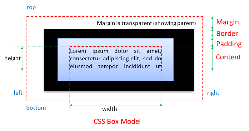
- The content area contains the texts, image, or child elements.
- The padding is the space between the content area and the border. It clears an area outside the content area. It has the same background as the content area.
- The border goes between padding and margin. You can set a color and a style (such as solid, dash, dotted) to the border.
- The margin is the space outside the border (to another element). It clears an area outside the border. The margin does not have a background, and is totally transparent.
As illustrated in the box model diagram, margin pushes its border (and content) away with a transparent background showing the parent (having the effect of pushing itself away from the parent); while padding pushes its content inwards with the same background. Margin and padding serve the same purpose if there is no border and background applied.
Take note that the width and height that you set for the element specify its content area, exclude the margin, border and padding. To get the actual size of the element, you need to add the margin, border and padding to the width/height. For example, suppose that:
#elm {
  width: 300px;
  margin: 10px;
  border: 5px solid black;
  padding: 20px;
}
The actual width of the element is 300+(10+5+20)x2 = 370px.
Each of the rectangular bounds has four sides, and can be individually referred to as xxx-top, xxx-right, xxx-bottom, and xxx-left in a clockwise manner, where xxx could be margin, border or padding. The four sides can be controlled individually or as a group.
Inspecting the Box Model via Web Developer Tools
[TODO]
CSS width and height Dimension Properties
These properties allow you to set up the dimension, such as the width and height of an element.
- width|height: auto|n|n%: The
widthandheightare specified in units such aspx(pixels), or percent (relative to the parent element). - max-width|max-height|min-width|min-height: none|n|n%: Set the minimum and maximum width and height.
As mentioned earlier, CSS length measurement requires a proper unit, e.g., width:400px or width:80%. Take note that width:400 is meaningless in CSS (this is a very common error!) However, in HTML, width="400" means 400 pixels.
The width and height properties are NOT inherited by its descendants. The default value is "auto", which lets the browser to compute a suitable value. We shall discuss "width:auto" value later.
CSS margin, border and padding Properties
The margin, border and padding related properties are:
- margin-top|margin-right|margin-bottom|margin-Left: auto|n|n%: Set the four margins individually. The "
n" shall be expressed in a proper unit (e.g.10pxand1.2em). You could use a negative value to overlap two elements (e.g.,margin-left:-100px). The value of "auto" lets the browser to compute an appropriate number. "n%" is relative to the same property (i.e. margin-xxx) of the parent. - (Shorthand) margin: top right bottom left
(Shorthand) margin: top right-left bottom
(Shorthand) margin: top-bottom right-left
(Shorthand) margin: all
These are one-line shorthand notations to set all the four margins. If four values are given, they are applied to top, right, bottom, left (in the clockwise manner). If two values are given, they are applied to top-and-bottom, left-and-right. If one value is given, it is applied to all the four borders.
Take note that there is no commas between the items, as all items are considered to be one property value. - padding-top|padding-right|padding-bottom|padding-left: n|n%: Set the four paddings individually, similar to
margin-xxx. - (Shorthand) padding: top right bottom left
(Shorthand) padding: top left-right bottom
(Shorthand) padding: top-bottom left-right
(Shorthand) padding: all
A one-line shorthand notation to set all the four paddings, similar tomargin. - border-width: thin|medium|thick|n
Set the width of the four borders. "n" can be used to set an absolute thickness.border-widthis a shorthand notation, you can useborder-width-top,border-width-right,border-width-bottom, andborder-width-rightto set the four borders individually. - border-style: none|hidden|dotted|dashed|solid|double|groove|ridge|inset|outset
Set the style of the 4 borders. Similarly, you can useborder-style-top,border-style-right,border-style-bottom, andborder-style-rightto set the four borders individually. - border-color: #rrggbb|rgb(r,g,b)|rgba(r,g,b,a)|color-name
Set the color of the 4 borders. Similarly, you can useborder-color-top,border-color-right,border-color-bottom,border-color-rightto set the four borders individually.. - (Shorthand) border: width style color
Shorthand notation to set all the properties of the borders, in the order shown. You can also use shorthandsborder-top,border-right,border-bottom, andborder-leftto set the four borders individually.
Margin, border, padding, width are NOT inherited by its descendants.
Example: [TODO]
More Margin Properties
- margin: 0 auto: set top and bottom margins to 0. Setting left and right margins to
autoequally distribute the extra horizontal space, and hence, center the element horizontally. - Collapsed Margins: When margin of two elements touching each other vertically, they collapsed (with the larger margin). But when two margins touches horizontally, they do not collapse.
- Negative Margin: margin is one of a few CSS properties that can be set to negative. This is used to overlap elements (without using absolute positioning). Padding and border cannot be negative.
More Border Properties
- border-radius: can be used to create a rounded border. You can also use it to convert a box to a circle (with
border-radius: 50%). - border-image: can be used to create a multi-color border.
Example [TODO]
CSS outline Properties
In addition to border, outline is a line that goes around the element, outside of the border, which does not take any space in the box model, and does not affect the position of the element.
- outline-color:
- outline-style: dotted|dashed|solid|double|groove|ridge|inset|outset: similar to
border. - outline-width:
width:auto
For most of the block elements (e.g., <div>, <p>), the default of width:auto sets the width to the width of the parent minus its own margin, border and padding. Images <img> have an auto width equals to its actual width. Float elements have auto width of 0.
Example: [TODO]
Filling the Width of the Containing Element
Browser would automatically adjust the margin-right to fill the container's width if the sum of its width, left and right margin/border/padding does not add up to the full width of the containing element. Take note that browser will not adjust the width, padding-right, border-right and the left margin/border/padding.
Example: [TODO]
Center a Block Element
To center a block element, you set the margin-left and margin-right to auto (browser divides the remaining width to left and right margins equally).
For example, all the selected <div> are centered:
div#header {
  margin: 10px auto;  /* 20px for top and bottom, auto for left and right */
}
div#footer {
  margin: 10px auto 5px auto /* top right, bottom, left */
}
div#content {
  margin-top: 10px;
  margin-right: auto;
  margin-bottom: 5px;
  margin-left: auto;
}
Example
The above box-model diagram was produced using these codes.
<div style="border:thin dotted black; background-color:#ffffdd"> <p style="margin:30px; border:20px solid black; padding:10px; background-color:#ddffff"> This block-level tag <p> has a 10-px <em>padding</em> (in light-blue, from the edge of the content to the border), 20-px <em>border</em> (in solid black) and 30-px <em>margin</em> (in yellow, from the border up to the dotted lines). Observed the 3 virtual rectangular boxes around the texts.</p>
</div>
CSS font Properties
The frequently-used font properties are:
- font-family: font-name|generic-family-name
A prioritized list of fonts to be used. The browser will try to use the first font if the it is available, and goes down the list.
The generic font family names include:serif(with small tails),sans-serif(without small tails),monospace,cursive,fantasy. Usemonospacefor program listing. Usesans-seriffor computer display.serifare mainly used in prints (such as "Times" for newspapers and books). - font-size:
n|n%|xx-small|x-small|small|medium|large|x-large|xx-large|smaller|larger - font-weight: normal|bold|bolder|lighter|100|200|...|800|900
You can use a number between 100 to 900, in multiple of 100. The value of 400 is the normal weight; while 700 is bold. - font-style: normal|italic|oblique
Theitalicuses italic font installed (some font families include the italic version); while theobliqueis done by tilting the normal font. - font-variant: normal|small-caps
Thesmall-capsis smaller than the uppercase. - (Shorthand) font: style variant weight size/line-height family
Set all the font properties using a one-line shorthand notation. The properties must follow the order shown above. However, the leading and trailing items can be omitted. For example,p { font-size: 16px; font-weight: bold; line-height: 140%; font-family: Arial, sans-serif; }is the same as:p { font: bold 14px/140% Arial, sans-serif; }
Font properties are inherited by its descendants.
Example: [TODO]
Google Fonts
"Google Fonts" @ https://fonts.google.com/ is a huge set of high-quality, free and open-source fonts. It is certainly the choice of the fonts today.
To use particular fonts, e.g., "Roboto" and "Roboto Mono", you can either:
- Add a
<link>to CSS (in your HTML'sHEADsection, e.g.,<link rel="stylesheet" href='https://fonts.googleapis.com/css2?family=Open+Sans&family=Roboto+Mono&display=swap'>
- Use a
@importin your CSS (you need not update all your HTML pages):@import url('https://fonts.googleapis.com/css2?family=Open+Sans&family=Roboto+Mono&display=swap');
CSS text Properties
The frequently used text properties are:
- text-align: left|right|center|justify
- line-height: normal|n|n%|factor
Set the height of the line. Thefactorgives the factor to be multiplied by the current font-size. E.g., factor of 1.5 means 1.5 times of the current font. - text-decoration: none|underline|overline|line-through|blink
Graphic designer dislikes "underline" and considers it as a legacy of typewriter. "blink" is even worse! - text-transform: none|uppercase|lowercase|capitalize
Thecapitalizetransforms the first letter to uppercase. - text-indent: n|n%
Indent the first-line of the paragraph. To indent all the lines of a paragraph (i.e., the whole block), use padding or margin. - letter-spacing: normal|n
word-spacing: normal|n
Additional spacing to be applied to letters or words. - white-space: normal|pre|nowrap
Specify how white spaces inside the element is to be handled. For "pre" (pre-formatted), preserve the white-spaces.
CSS background Properties
The background related properties are:
- background-color: #rrggbb|rgb(r,g,b)|rgba(r,g,b,a)|color-name|transparent
Set the background color of an element. The default istransparent. - background-image: url(imageURL)|none
Use an image as the background. - background-repeat: repeat|repeat-x|repeat-y|no-repeat
Define how the background image shall be repeated in x and y direction or both. - background-attachment: scroll|fixed
Define whether background image shall scroll with the page or fixed. - background-position: x y|x% y%|top left|top center|top right|center left|center center|center right|bottom left|bottom center|bottom right
Set the initial position of the background image. Note that there are two values, specifying the x and y position respectively. - (Shorthand) background: color image repeat attachment position: one-line shorthand notation.
In all the above, the term background refers to the background of the elements selected (not necessary the entire window). In other words, you can set an image as the background of an element.
CSS list-style Properties
The properties are:
- list-style-type: none|disc|circle|square
list-style-type: decimal|decimal-leading-zero
list-style-type: lower-alpha|upper-alpha|lower-roman|upper-roman|lower-greek|lower-latin|upper-latin
Set the style of the list item<li>marker (bullet) for<ul>,<ol>respectively. - list-style-position: inside|outside: Define whether the list item marker shall be inside or outside the item element.
- list-style-image: none|url(imageURL): Use an image as the list item marker.
- (Shorthand) list-style: type position image: Shorthand notation to specify all the properties of the list.
Example: [TODO]
CSS Table Properties
- border-collapse: collapse|separate
Collapse or separate the adjacent cells shared border into one. - border-spacing: n
For separate border, specify the distance between border (i.e., the deprecatedcellspacingattribute) - caption-side: top|bottom|left|right
Specify which side to show the caption. - empty-cells: show|hide
- table-layout: auto|fixed
More HTML
Image Maps
Image maps are "clickable" image that loads different pages depending on where (or which hot-regions) you click on the image. Each hot region of the image map can be associated with a different link. There are two type of image maps:
- Client-side image map: browser at the client-side handles the mapping of hot-regions to links.
- Server-side image map: server handles the mapping of hot-regions to links. The co-ordinates of the location clicked are sent to the server to be processed by a program (such as a CGI/ASP/JSP/PHP script). The mapping information is held on the server.
Client-Side Image Map
To create a client-side image map:
- Define a image map using
<map>...</map>and define the hot-regions in the map using the<area>tags. Decide what link maps to which hot-region. Hot regions can take circle, rectangle, or polygon in shape. - In the
<img>tag, add the attributeusemap="#mapName"to indicate this image is used as a client-side image map.<map id="myMap"> <area shape="circle" href="url1" coords="xc, yc, r"> <area shape="rect" href="url2" coords="topLeftX, topLeftY, bottomRightX, bottomRightY"> <area shape="poly" href="url3" coords="x1, y1, x2, y2, ..., x1, y1"> </map> <img usemap="#myMap" src="client_map.gif">
Example:
<map id="myMap">
  <area shape="rect"   coords="20,20,160,60" href="http://www.zzz.com/">
  <area shape="circle" coords="80,120,60,60" href="http://www.yyy.com/">
</map>
<img usemap="#myMap" src="banner.jpg">
Client-side Image Map Tags - <map> and <area>
Function: To set up a client-side image map with hot regions.
Syntax (map: Container tag, area: Standalone tag)
<map id|name="map-name">
  <area shape="rect|circle|poly|default"
  coords="coordinates-list"
  href="URL" nohref
  target="_blank|_parent|_self|_top|target-frame-name"
  alt="alternative-text" />
  ... more-area-declarations ...
</map>
<map>'s attributes:
id|name="map-name": declares a unique name for the map, to be targeted in attributeusemap="#map-name"of the<img>.
(The attributenameis used the older browsers. XHTML specifies usingidinstead, which automatically create a named anchor.)
<area>'s attributes:
shape="rect|circle|poly|default": define the shape of the hot region. The "default" value for any point not part of another hot region.coords: list of coordinates that made up the hot region.- For
shape="rect",coords="topLeftX, topLeftY, bottomRightX, bottomRightY"to specify the upper-left and lower-right corners. - For
shape="circle",coords="xc, yc, r", where(xc, yc)is the center andris the radius. - For
shape="poly",coords="x1, y1, x2, y2, ..., x1, y1", where(xi, yi)are coordinates that made up the polygon. You should close the polygon by putting(x1, y1)as the last coordinates.
- For
href="url": gives the target URL of the hyperlink.nohref: deactivate the hot region, pointing to nowhere.- If two hot regions overlap, the first takes effect.
A client-side image map can be used as a navigation bar on top of the page, instead of using individual images. This may save some transmission overhead, as each individual image triggers its own HTTP request.
Server-Side Image Map
On the <img> tag, include the "ismap" (is server map?) attribute, and wrap the <img> within an anchor <a>...</a>. For example,
<a href="http://www.zzz.com/search.jsp"><img ismap src="logo.jpg"></a>
Click on the image and observe the URL
When the image is clicked, the (x, y) position of the click is send to the server as query parameters. For example,
http://www.zzz.com/search.jsp?39,22
It is up to the server to decide on how to process the (x, y) position received via a server-side program (such as CGI/ASP/JSP/PHP/Servlet).
Client-Side vs. Server-Side Image Map
Client-side image map is much more popular (and recommended) than server-side image map because:
- Mapping for client-side image map is processed by the browser locally with immediate response, without connecting to the server and waiting for server to response.
- No special server-side programs needed, relies solely on the browser to process the mapping of the hot regions.
Frames
You can divide the browser's window into multiple regions called frames. Each of the frames can contain a distinct and complete HTML document. Framed layout enables you to display several HTML document at once. Framed layout is popular for:
- Dividing the window into a navigation frame (on the top or left-side of the window) and an actual content frame.
- Dividing the window into a small summary frame and a detail frame. Java API documentation is a good example.
However, use frames with extreme care! Frame (especially the "header" frame) occupied precious screen asset, as it does not scroll away! Framed layout have fallen out of favor over the years. Use <div> and CSS to organize your web page instead.
The tags involved are:
<frameset>...</frameset>: to sub-divide the window.<frame>: defines each of the frames in a frameset.<iframe>...</iframe>: for floating or inline or internal frame.<noframe>...</noframe>: alternative text if frame is not supported by browser.
Frame Set <frameset>...</frameset>
Function: To divide the window into multiple frames, row-wise or column-wise. <frameset>...<frameset> can be nested for complex layout. <frameset>...<frameset> is to be used in place of <body>...<body> tag. i.e., there should not have an <body> tag in the document with <frameset>.
Syntax:
<frameset rows="list-of-row-sizes">
   ...frame-declarations...
</frameset>

<frameset cols="list-of-column-sizes">
   ...frame-declarations...
</frameset>
Attributes:
rows|cols="n|n%|*, n|n%|*, ...": a list of frame sizes in pixels or percentage separated by commas. Wildcard "*" can be used to indicate the remaining space.
Example:
<frameset rows="100, 20%, 150, *">
  ...frame-declarations...
</frameset>
Divide the window into four rows of sizes: 100 pixels, 20% of the screen, 150 pixels, and the remaining space.
Individual Frame <frame />
Function: Declare each individual frame, and place the HTML document.
Syntax:
<frame
  src="url"
  name="frame-name"
  noresize
  frameborder="0|1"
  scrolling="yes|no|auto" />
Attributes:
src:="url": provides the URL of the document to be displayed inside this frame.name: specifies an unique identifier, to be used as the target of other tags, such as<a>,<form>.noresize: suppresses resizing by dragging of border.frameborder: sets to 1 to show the border, 0 to suppress.scrolling: "yes" to show scrollbars and allow scrolling; "no" to suppress scrolling; and "auto" to let the browser to decide (e.g., auto-hide).
Example: Divide the screen into 3 frames, top, left and right.
<frameset rows="50, *">
  <frame src="navigation.html" name="navigation" noresize>
  <frameset cols="100, *">
    <frame src="summary.html" name="summary">
    <frame src="detail.html" name="detail">
  </frameset>
</frameset>
Targeting Named Frame
To control which frame to receive the content of a hyperlink, you could include the target attribute in the <a> tag. Using the previous example, a hyperlink in the "navigation" frame targeting the "detail" frame is:
<a href="chapter5.html" target="detail">Chapter 5</a>
If all the links in the "navigation" frame are targeting the "detail" frame, you can use the <base> tag (in the HEAD section) to set up a global target reference:
<!-- navigation.html -->
<head>
  <title>navigation bar</title>
  <base target="detail">
</head>
As mentioned, frames has gone out of favor these day. The HTML5 introduced new elements such as <header>, <footer>, <section>, <nav>, <article> to help you in organizing your web page, instead of using frame, division, or table.
No Frame <noframe>...</noframe>
Function: Provides an alternative text if the browser does not support framed layout. <noframe> must be placed within a <frameset>.
Syntax (Container tag):
<noframe>...alternative-text...</noframe>
Iframe (Inline Frame or Internal Frame) <iframe>...</iframe>
Function: Place an inline frame on the browser window. An iframe is a frame that can be embedded within a regular HTML page, which contains a separate and complete HTML document, set via its src attribute.
Syntax (Container tag):
<iframe
   src="URL"
   name="frame-name"
   frameborder="0|1"
   scrolling="yes|no|auto">
     ...alternative-text...
</iframe>
You could use CSS to position and style the iframe. Iframe is used extensively by JavaScript and Ajax.
Example: [TODO]
Embedding Programs
Client-side programs such as Java Applets, MS ActiveX controls, JavaScript, VBScript, Flash, can be embedded inside an HTML document. These programs will be downloaded from the server and executed inside the browser. The browser supports the execution of client-side programs via a built-in processor or plug-in (e.g., the Java JRE Plug-in, Flash player plug-in).
The markup tags involved here are:
<applet>...</applet>: for embedded Java Applets (deprecated in HTML 4 in favor of<object>tag).<object>...</object>: for embedded an executable programs.<param>: providing runtime parameters to<applet>and<object>.
Java Applet <applet>...</applet>
Function: Embedding a Java Applet. Deprecated in HTML 4 in favor of <object>.
Syntax (Container tag):
<applet
  code="applet-main-class-name"
  archive="applet-jar-file"
  object="serialized-applet-file"
  width="applet-window-width-in-pixels"
  height="applet-window-height-in-pixels"
  codebase="base-URL-of-the-applet"
  alt="alternative-text">
    ...alternative-text...
</applet>
Program Object <object>...</object> and Parameter <param>
Function: Embed an executable program and provide the program parameters. <param> must be nested inside an <object> or <applet>.
Syntax <object> (Container tag), <param> (Standalone tag):
<object
  classid="program-info"
  codebase="base-URL-of-the-program"
  codetype="code-mime-type"
  data="URL-of-the-data"
  type="data-mime-type"
  archive="list-of-archive"
  usemap="#map-name"
  tabindex="tabbing-position">
     ...alternative-text...
</object>

<param
  id="unique-identifier"
  name="parameter-name"
  value="parameter-value"
  valuetype="data|ref|object"
  type="parameter-mime-type">
HTML Global Attributes
The global attributes are applicable to ALL the HTML elements.
- class="classname": specifies the subclass this tag belongs to. The
classattribute can have more than one values. The class value needs not be unique. Classes are primarily used by CSS for applying style rule, selected via the class-selector (in the form of.classnameortagname.classname). See the "CSS Section" above. - id="idValue": for declaring an unique, document-wide identifier to a particular tag. No two tags can have the same
idvalue, while many tags can belong to the sameclass. Theidattribute is used by CSS for applying styles (via the id-selector in the form of#idName), and JavaScript for manipulating the element (viadocument.getElementById()function). - style="rule": for applying inline style to a tag, applicable to this tag only. See the "CSS Section".
- title="tooltip-text": gives an advisory text description for this tag, and display as tool tip when you point your mouse pointer over the element.
- lang="value": specifies the language used by this particular tag.
- dir="LTR|RTL": specifies the direction of the text for this tag. It takes values of
LTR(left-to-right) orRTL(right-to-left).
HEAD Section's Tags
The following tags can be used in the HEAD section:
- <title>...</title>: provides a title to this document.
- <meta>: provides meta information of this document.
- <link>: establishes the linked resources and their relationship, in particular, the external CSS style sheet.
- <base>: declares a base URL for all the links in this document, and the
nameof the target frame. - <style>...</style>: embedded style rules applicable to this document.
- <script>...</script>: program scripting codes.
Base-URL and Default Target Name <base>
Function: Declare the base URL for all the links in this document via attribute "href", and specify the target name via attribute "target".
Syntax:
<base href="base-URL" />
<base target="target-frame-name|_blank|_parent|_self|_top" />
Attributes:
- href="baseUrl": All relative URLs in this document are relative to this base-URL. For example, if
<base>’shrefis set to:<base href="http://www.aaa.com/bbb/index.html" />
then, the relative URL of "ccc/test.html" is resolved to "http://www.aaa.com/bbb/ccc/test.html". - target="target-frame-name|_blank|_parent|_self|_top": specifies the target frame into which all linked document should be loaded: "
_blank" in new window, "_self" in this frame, "_parent" in the parent frame, "_top" in the full body of the window.
Link Resources and Relationship <link>
Function: Link to another resource and indicate its relationship. There could be more than one <link> tags in the HEAD section.
Syntax:
<link href="url"
      type="mime-type"
      rel="forward-relationship"
      rev="reverse-relationship"
      charset="character-encoding"
      hreflang="language-of-href"
      media="intended-display"
      target="target-frame-name" />
Attributes:
- rel, rev: indicates the forward or reverse relationship to the current document. Take value of
home,stylesheet,help,index,toc,up,next,previous,glossary,copyright, andmade(i.e., author).
[TODO] other attributes.
Example:
<head>
  <link href="master.css"    rel="stylesheet" type="text/css" />
  <link href="index.html"    rel="home" />
  <link href="help.html"     rel="help" />
  <link href="chapter5.html" rev="previous" />
  <link href="chapter3.html" rev="next" />
</head>
The above <link> tags indicate that "master.css" is the stylesheet of MIME type "text/css"; "index.html" is the home page; "help.html" is the help page; this page ("chapter4.html") is the previous page of "chapter5.html" (in a reverse relationship), and this page is the next page of "chapter3.html".
The most-commonly used <link> is to specify the external CSS style sheet. The rests are hardly used.
Including an Icon
A favicon (aka favorite icon, shortcut icon, URL icon) is a file containing a small 16x16 icon. Browser can display the icon besides the URL bar or bookmark. The favicon file is usually called "favicon.ico".
To include an icon, provide a <link> tag in the <head> section, as follows:
<link rel="icon" href="favicon.ico" type="image/x-icon" />

<!-- To support IE as well, use this  -->
<link rel="shortcut icon" href="favicon.ico" type="image/x-icon" />
You can use PhotoShop/Element to create a favicon file; or use a simple imaging tool (such as MS Paint) to create a small image and then submit to an online converter to generate a favicon file.
Meta Information <meta>
You can use <meta> tag to include meta information about the document, such as keywords, author, expiration date, and page generator. The syntax is:
<meta name="name" content="value" />
Examples:
<meta name="keywords" content="Java, HTML, CSS" />
<meta name="author"   content="Tan Ah Teck" />
The <meta> tag can also be used to ask the server to insert an HTTP response header (read "HTTP Basics"). The syntax is as follow:
<meta http-equiv="http-response-header" content="value" />
EXAMPLE 1: Auto-Redirect after x seconds
<html>
<head>
  <meta http-equiv="Refresh" content="3; Url=http://www.google.com/" />
</head>
<body>
  <p>You will be redirected to ... in 3 seconds unless you push the STOP button</p>
  One thousand...<br>
  Two thousand...<br>
  Three thousand...
</body>
</html>
The above <meta> tag triggers the server to include the following "Response Header" in the HTTP response message, when the page is downloaded:
Refresh: 3; Url=http://www.google.com/
The browser, in response to this response header, redirect to the given URL after 3 sec.
EXAMPLE 2: Auto-Refresh every x seconds
<meta http-equiv="Refresh" content="3" />
EXAMPLE 3: Specify the character set used in the HTML document.
<meta http-equiv="Content-Type" content="text/html; charset=utf-8" />

// HTML5
<meta charset="utf-8" />
The server will include this response header in the response message, when the page is downloaded:
Content-Type: text/html; charset=utf-8
Embedded Style Definition <style>...</style>
Function: For embedded style declarations, covered earlier.
Scripting Codes <script>...</script>
Function: For embedding scripting codes. See my "Introduction to JavaScript" on usage and examples.
More CSS
CSS Variables (Custom Properties)
CSS Variables (aka Custom Properties or Cascading Variables) allows you to define variables and using that variables in multiple properties, in a style sheet. This is really useful in setting themes (without using a preprocessor such as LESS or SASS).
Rules:
- The name of the variables shall begin with two dashes (
--), e.g.,--main-bg-color. - To reference the variable, use
var(--varname). - To define global-scope CSS variables, place them in the
:rootpseudo-class.
For examples,
:root {
  --dark-theme-bg-color: black;
  --dark-theme-color: white;
}

......

body {
   background-color: var(--dark-theme-bg-color);
   color: var(--dark-theme-color);
   ......
}
Modifying CSS Properties from JavaScript and jQuery
To modify the styles of an HTML element from JavaScript, set its style property, e.g.,
let header = document.getElementById("header")
header.style.fontFamily = 'sans-serif'
header.style.fontSize = '24px'
To modify the style of an HTML element from jQuery:
/* Modifying one CSS property */
$('#footer).css('margin-top', '8px')
/* more than one CSS properties */
$('#footer').css({
   'margin-top': '10px',   /* need to quote for special character */
   padding: '10px',
})
CSS position Property - Positioning the HTML Block Elements
position: static|absolute|relative|fixed|inherit|initial|unset
You can use the property position to alter the position of block elements.
Each element has a natural location inside a page's flow, in the order read in by the browser. By default (position:static), elements are displayed from top to bottom in the normal flow. For block elements, line breaks are inserted at the beginning and the end to form a rectangular box.
You can remove the box from the normal flow and specify its location with respect to either its parent element (position:absoluteposition:fixed); you can also move the box with respect to its normal-flow position (position:relative).
For non-static positioned elements, the new position is specified via top, left, bottom, right, width, height properties:
- top|left|bottom|right: n|n%|auto: Set the distance from the edge of this element to the corresponding edge of the containing block.
- width|height: n|n%|auto: Set the width and height of this block element.
- z-index: number|auto: When two blocks overlap due to re-positioning, the one with larger
z-indexnumber is on top (i.e., z-axis is pointing out of the screen as in the standard 3D graphics coordinates system). Negative number is allowed. The defaultautostacks the element at the same level as its parent. If thez-indexof two elements are the same or noz-indexare defined, the last element rendered is placed on top. z-index with alpha can create see-thru effect. - overflow|overflow-x|overflow-y: auto|hidden|scroll|visible|inherit: Specify how to handle content overflowing the block's width/height.
- overflow-wrap: normal|break-word|inherit: specify whether or not the browser can break lines with long words, if they overflow the container.
position:static (default)
The default position:static positions the element according to the normal flow of the page, in the order that is read by the browser. Properties top, right, bottom, left has no effect for static.
position:relative
Move the element relative to its normal-flow position. The original space occupied by this element is preserved. The surrounding elements are not affected. For example,
<!DOCTYPE html>
<html lang="en">
<head>
<meta charset="utf-8">
<title>Test CSS "position" Property</title>
<style>
div.up {
  position: relative;  /* relative to normmal-flow position */
  top: -20px;          /* from the top of normal-flow */
  left: 30px;          /* from the left of normal-flow */
}
div {
  height: 80px;
  width: 200px;
  background-color: lightgray;
  margin: 5px;
}
</style>
</head>
<body>
  <div>Division 1</div>
  <div class="up">Division 2</div>
  <div>Division 3 (Division 2 preserves its space)</div>
</body>
</html>
position:absolute
Position the element relative to the first non-static ancestor element; or <body> if no such element is found. Absolute-positioned element is taken out from the normal flow, as if it does not present.
To absolutely position an element in a containing element (other than <body>), declare the containing element relative without any movement, e.g., container { position:relative }.
Absolute positioning is interesting. You can create animation (such as bouncing ball and falling snow) by absolutely position (and repeatedly re-position) images on the browser's screen. See my "JavaScript Examples".
For example,
<!DOCTYPE html>
<html lang="en">
<head>
<meta charset="utf-8">
<title>Test CSS "position" Property</title>
<style>
#left-panel {
  position: absolute;
  top: 10px;      /* from top edge  */
  left: 10px;     /* from left edge */
  width: 200px;
  height: 600px;
  background-color: lightblue;
}
#main-panel {
  position: absolute;
  top: 10px;      /* from top edge, same as left-panel */
  left: 220px;    /* from left edge 10+200+10 */
  width: 560px;
  height: 600px;
  background-color: lightgray;
}
</style>
</head>
<body>
  <div id="left-panel">Left Panel</div>
  <div id="main-panel">Main Panel</div>
</body>
</html>
position:fixed
The element is fixed at the position relative to the browser's window, and it does not scroll away. The position is defined in top, left, bottom, right (or width and height) properties. Fixed-positioned element is taken out of the normal flow, as if it is not present.
For example, a fixed <div> is added to the above example in absolute positioning. Take note that z-index is used to ensure that the fixed <div> is always on top of the other <div>'s, regardless of the order of writing the <div>'s.
<!DOCTYPE html>
<html lang="en">
<head>
<meta charset="utf-8">
<title>Test CSS "position" Property</title>
<style>
#left-panel {
  position: absolute;
  top: 10px;      /* from top edge  */
  left: 10px;     /* from left edge */
  width: 200px;
  height: 600px;
  background-color: lightblue;
}
#main-panel {
  position: absolute;
  top: 10px;      /* from top edge, same as left-panel */
  left: 220px;    /* from left edge 10+200+10 */
  width: 560px;
  height: 600px;
  background-color: lightgray;
}
#fixed-panel {
  position: fixed;
  top: 50px;
  left: 100px;
  width: 200px;
  height: 200px;
  background: lightgreen;
  z-index: 200;   /* larger z-index is on top */
}
</style>
</head>
<body>
  <div id="left-panel">Left Panel</div>
  <div id="main-panel">Main Panel</div>
  <div id="fixed-panel">Fixed Panel (does not scroll away)</div>
</body>
</html>
CSS float and clear Property - Floating an Element Left or Right
float: left|right|none
You can push an element to the left or right edge of the containing element via property float. Float is often used for images, with texts surrounding the floated element. The elements preceding the floated element are not affected. The element after the floated element flows around it.
You can float horizontally (i.e., left and right), not up and down. Other than images, a float element shall have the width and height explicitly specified. Float elements are actually taken out of the normal flow. The following element acts as if the floated element is not there, but the enclosing texts would wrap around the floated element.
If many images are floated together (says to the left), the second image will be pushed to the left edge of the first image, and so on if there is available horizontal space; and shifted down otherwise. For example, we can float many thumbnail images to the left as follows:
img.thumbnail {
  float: left;
  margin-right: 10px;  /* add margin-right for float:left */
  width: 120px;
  height: 100px;
}
To turn off the float, use property clear, and specify which side (left, right or both) does not allow a floating element.
clear: left|right|both|none
clear:left means that the left side of this element cannot be a floating element. That is, the left shall begin with left margin of the containing element. clear:left is similar to <br>.
Using float to create columns
Block elements, by default, begins at the left edge and occupies the full-width of the containing element. Hence, it will not line up one besides another in a column format. You can use float property to create columns or grid.
[TODO] more
Example: Positioning an Iframe
"iframeTest.html"
<!DOCTYPE html>
<html>
<head>
  <title>iframe Test</title>
  <link rel="stylesheet" href="iframeTest.css">
</head>
<body>
  <iframe src="iframeContent.html" name="myIframe" id="myIframe"></iframe>
  <h1>Hello</h1>
</body>
</html>"iframeTest.css"
body {
  background-color: #FFF;
}

#myIframe {           /* ID-Selector */
  float: right;       /* float with the right margin of the browser's window */
  margin-top: 100px;  /* margin from the top of the window */
  border: 1px solid black;
  width: 350px;
  height: 300px;
}
The CSS property float: left|right|none (also applicable to <img>) floats the iframe to the left or right margin of the browser's window.
You can also use CSS property position: absolute|fixed|relative|static to position the iframe (and other HTML elements), "absolute" positions the element relative to its first positioned ancestor element; "fixed" is relative to the browser window and does not scroll away; "relative" means relative to its normal position; the default "static" positions the element in the order it appears in the document.
#myIframe {
  position: absolute;
  left: 300px;
  top: 50px;
  border: 1px solid black;
  width: 350px;
  height: 300px;
}
CSS display and visibility Properties
display: block|inline|inline-block|none|list-item|table|table-row|table-cell|grid|inline-grid
- block and inline: The
displayproperty controls the layout and flow of an HTML element. Most elements have a defaultdisplayvalue ofblock(<div>,<p>) orinline(<span>,<em>).
Thedisplay:blockcan be used to display an inline element as a block. For example,image#id1 { /* display this image as block and center */ display:block; margin: 5px auto; } span.block { /* display this class of inline element <span> as a block */ display:block; }On the other hand,display:inlinecan be used to display a block element inline. For example,li { /* display this block element inline without line break */ display:inline; } - inline-block: blend the element in with the flow of the text, while allowing us to use padding, margin, height and similar properties which has no visible effect on inline elements.
- none: will NOT be displayed and not taking up space (vs.
visibility:hiddenwould not display the element but the element still take up space) - list-item: display the element as if it is a
<li>. - table, table-row, table-cell: to display the element (
<div>) as<table>,<tr>,<td>. - grid: display in a grid, for example,
<!DOCTYPE html>
<html lang="en">
<head>
<meta charset="utf-8">
<title>Test grid layout</title>
<style>
#main {
  display: grid;
  grid-template-columns: 100px 50px 100px;
  grid-template-rows: 100px 100px;
}
section {
  height: 50px;
  width: 80px;
  background-color: lightgray
}
#main #section1 {
  grid-column: 1;  /* column numnner */
  grid-row: 1;     /* row number */
}
#main #section2 {
  grid-column: 2;
  grid-row: 1;
}
#main #section3 {
  grid-column: 1;
  grid-row: 2;
}
#main #section4 {
  grid-column: 3;
  grid-row: 2;
}
</style>
</head>
<body>
<main id="main">
  <section id="section1">Section 1</section>
  <section id="section2">Section 2</section>
  <section id="section3">Section 3</section>
  <section id="section4">Section 4</section>
</main>
</body>
</html>
visibility: hidden|visible: used to hide or show the element without removing the element from the normal flow of the page. That is, the space occupied by the element is preserved.
CSS cursor Property
cursor: auto|crosshair|default|help|move|wait|pointer|progress|text
cursor: n-resize|ne-resize|nw-resize|s-resize|se-resize|sw-resize|w-resize|e-resize
You can use property cursor to change the mouse pointer.
Example: [TODO]
Link To HTML/CSS References & Resources