HTML Form & HTTP Request
An HTML Form (Web Form) allows a web user to interact with the server. An HTML form contains input elements (or fields, controls, widgets), such as text fields, checkboxes, and buttons. These input fields allow web users to supply data (called request parameters or query string) to the web server. Over at the web server, a server-side program collects these data and returns a dynamic response based on the inputs submitted.
HTML Form By Examples
EXAMPLE 1: Basic <form> Structure
<!DOCTYPE html>
<!-- HtmlFormEx1.html -->
<html lang="en">
<head>
<meta charset="utf-8">
<title>Basic HTML Form Structure</title>
</head>
<body>
<form action="submit.php" method="get">
  <label for="username">Username</label><br> <!-- "for" targets "id" -->
  <input type="text" id="username" name="username"><br> <!-- "name" for "name=value" pair -->
  <label>Password<br>
  <input type="password" name="password"></label><br>
  <input type="submit" value="SEND">
  <input type="reset" value="RESET">
</form>
</body>
</html>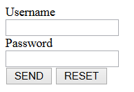
- An HTML form is enclosed within
<form>...</form>tags. The attributeactionprovides the URL for which this form is to be submitted. The attributemethodspecifies the HTTP method (GET or POST) to be used for submission. - There are 2 input elements in this form:
<input type="text">: a text field for users to enter data.<input type="password">: for password entry - displayed as * on the screen.
<label>to label each of the<input>. You can either match theforattribute of the<label>to theidattribute of the<input>element to be labeled (as in the first<input>); or wrap the<input>inside the<label>(as in the second<input>). The<label>improves the usability for the mouse-user. When you click on the<label>, the labeled<input>element is selected. - There are 2 buttons in this form:
<input type="submit">: The so-called Submit button. Clicking the submit button sends the data to theactionURL.<input type="reset">: The reset button, which clear all the input fields.
valueattribute of the button appears as the label of the button. - When the user submit the form, the browser collects the request parameters from the input elements, in the form of
name=valuepairs. Thenamecorresponds to thenameattribute of the<input>elements; thevaluecorresponds to the text entered. In this example, there are two sets ofname=valuepairs -username=xxxandpassword=yyy. The request parameters are joined together via a&sign, i.e.,username=xxx&password=yyy, to form a so-called query string. The query string is then append behind the action URL via a?sign, i.e.,submit.php?username=xxx&password=yyy. As URL does not accept special characters, they are encoded in the form of%hh(called URL encode), where hh is the ASCII code in hexadecimal, e.g.,~is encoded as%7e;^as%5e. Space can be encoded in%20or+for simplicity. - Try submitting the form. Observe the request parameters in the submitted URL. You are expect to get an error 404, as you have yet to write the server-side processing program "
submit.php". - The server-side program receives the query string; URL decodes the special characters; and performs operations based on these parameters (e.g., query the database). It then returns an appropriate response to the client. I will not cover server side programming in this article. Read the respective server-side programming techniques such as PHP, Java Servlet, JSP, and etc.
EXAMPLE 2: More Controls and Input Validation
<!DOCTYPE html>
<!-- HtmlFormEx2.html -->
<html lang="en">
<head>
<meta charset="utf-8">
<title>Input Validation</title>
</head>

<body>
<form action="submit.php" method="get">
  <fieldset>
    <legend>Login</legend>
    <label for="username">Username*</label><br> <!-- "for" targets "id" -->
    <input type="text" id="username" name="username" required><br>
    <label for="password">Password*</label><br>
    <input type="password" id="password" name="password" required pattern=".{4,}">
  </fieldset>

  <fieldset>
    <legend>Gender*</legend>
    <label><input type="radio" name="gender" value="m" required> Male</label>
    <label><input type="radio" name="gender" value="f"> Female</label>
  </fieldset>

  <fieldset>
    <legend>Programming Skill</legend>
    <label><input type="checkbox" name="programming" value="java"> Java</label>
    <label><input type="checkbox" name="programming" value="cpp" checked> C++</label>
    <label><input type="checkbox" name="programming" value="csharp"> C#</label>
  </fieldset>

  <fieldset>
    <legend>Fruit</legend>
    Choose a fruit:
    <select name="fruit">
      <option value="apple">Apple</option>
      <option value="banana" selected>Banana</option>
      <option value="orange">Orange</option>
    </select>
  </fieldset>

  <textarea name="comment" placeholder="Enter your comment here" rows="5" cols="40" maxlength="180"></textarea><br>

  <input type="submit" value="SEND">
  <input type="reset" value="RESET">
</form>
</body>
</html>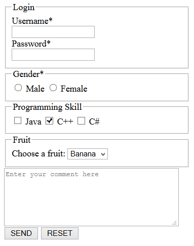
- We can group a set of related input fields into
<fieldset>and provide a descriptive<legend>. The input fields will be enclosed in a box, with the legend shown on the top border. - In
<input type="text">(Line 14), attributerequiredis added to request browser to validate that this field is not empty. Browser will display an error message and will not submit the form if this field is empty.This attributerequiredis known as boolean attribute, as it does not have a value. - In
<input type="password">(Line 16), besides the attributerequired, attributepattern=".{4,}"requests browser to perform "Regular Expression Pattern Matching", in this case, 4 or more characters. - Radio buttons (can check at most one button) are marked by
<input type="radio">'s. Each<input>has its associated<label>. We typically use the samenameattribute for all the buttons, and assign differentvaluefor each button. You can place therequiredon any one of the button to request the browser to validate that one is checked. - Checkboxes (can check zero or more boxes) are marked by
<input type="checkbox">. We addedcheckedattribute on one of the box, to set its initial state. Attributecheckedis applicable to checkboxes, as well as radio buttons. - Pull-Down menu is defined via a
<select>element, with each item marked by an<option>. We set the common name in thenameattribute of the<select>, and differentvaluein<option>. We can also mark the selected element via attributeselectedin the<option>. - Textarea (multi-line input text field) is marked via
<textarea>...</textarea>. The attributeplaceholderis applicable to all input text fields, which shows a hint in the input field before the user enters a value. The attributemaxlengthrequest browser to limit the length of the input. - Try submitting the form. Observe the request parameters in the submitted URL.
EXAMPLE 3: HTML5 Input Controls and Validation
See examples below.
[TODO] comprehensive example.
The HTML Form's Syntax
The <form> Element and its action Attribute
An HTML form is enclosed by a <form> element. The attribute action specifies the URL for which this web form is to be submitted, which default to the current page. The attribute method specifies the HTTP method used for submission, i.e., GET or POST (with default of GET).
<form method="get|post" action="url">
  ... Input elements ...
  ... Submit/Reset buttons ...
</form>
The input fields (or controls, widgets) are placed Inside the <form>.
Grouping Input Fields: The <fieldset> and <legend> Elements
A well-designed web form uses <fieldset> to group the input fields into sets, with a <legend> to provide a descriptive legend for the fieldset. For example,
<fieldset>
  <legend>Contact Details</legend>
  <label for="name">Name</label>
  <input id="name"><br>
  <label for="telephone">Telephone</label>
  <input id="telephone"><br>
  <label for="email">Email</label>
  <input id="email"><br>
</fieldset>
Labeling <input> Fields: The <label> Element
Each <input> field is typically associated with a <label> to label the input field. You can bind an <input> element to a label by either:
<label>as wrapper: place the<input>element within the<label>...</label>tags.<label>as reference: matching the "for" attribute of the<label>element with the "id" attribute of the input element.
<!-- Enclose <input> inside <label> -->
<!-- Label text can be in front or behind the <input> -->
<label>Name: <input type="text" name="username"></label>
<label><input type="radio" name="gender" value="m">Male</label>
<label><input type="radio" name="gender" value="f">Female</label>

<!-- Matching "for" with "id" -->
<label for="username">Name</label>
<input type="text" id="username" name="username">
Label does not have any visual effect. But if you click on the label, the associated input field will be selected.
Input Controls
Input fields are marked by <input>, <textarea>, <select> and <button>. The <input> is a standalone element, with attribute type to specify its sub-types (e.g., type="text" and type="checkbox"). On the other hand, <textarea>, <select>, <button> are container elements.
| Element | Control | Description | Example |
|---|---|---|---|
| <input type="text"> (default) | Single-line Text Input Field | For text input. The default type for <input>. |
|
| <input type="password"> | Single-line Password Input Field | Password shown in asterisk (*). |
|
| <textarea>...</textarea> | Multi-line Text Input Field | For text input. | |
| <input type="checkbox"> | Checkbox | Can check zero or more boxes | |
| <input type="radio"> | Radio Button | Can check at most 1 button | |
| <select>...</select> <optgroup>...</optgroup> <option>...</option> |
Drop-down List | ||
| <input type="submit"> | Submit Button | Click to submit the form to the server | |
| <input type="reset"> | Reset Button | Reset all fields to their default value | |
| <input type="image"> | Image Button | Use an image as submit button | |
| <input type="button"> | Generic Button | ||
| <input type="file"> | File Chooser | ||
| <input type="hidden"> | Hidden Field | ||
| <button>...</button> | Button | Same as <input type="button"> |
|
| <input type="email"> (HTML5) | Email Address | Can be validated. | |
| <input type="url"> (HTML5) | URL | Can be Validated. | |
| <input type="number"> (HTML5) | Numeric value | You can use attributes min|max to specify the min and max values; and step to specify the step size (default of 1).Many browsers add a spin button (with up/down arrow) to the right corner of the box |
|
| <input type="range"> (HTML5) | Numeric value | You can use attribute min|max to specify the min and max values.Many browsers use a slider for range. |
|
| <input type="color"> (HTML5) | Color Chooser | Browser may pop-up a color chooser. | |
| <input type="datetime_local"> <input type="datetime"> <input type="date|time|month|week"> (HTML5) |
Date and Time | Browser may provide a drop-down calendar. Poorly supported now. | |
| <input type="tel"> (HTML5) | Phone number | No validation as phone numbers vary across countries. | |
| <input type="search"> (HTML5) | Search keywords | Search Box for entering search keywords. No validation. | |
| <datalist>..</datalist> <option> (HTML5) |
Suggested List for input | Define a list of "suggested" options for <input type="text"> |
|
| <output>..</output> (HTML5) | Generated Output | Define the result of a computation (by JavaScript) | |
| <keygen> (HTML5) | Define a public-private key pair field for authentication of the form |
Input Control Attributes
Besides the common attributes such as id, class, name, value, alt, the following attributes are applicable to input elements:
- type: as above
- autofocus: this input control shall receive the focus when the page is loaded.
- disabled: disable the input control. Disabled controls are not sent on submission, and cannot receive focus.
- checked (for
radio,checkbox): indicates that this value is selected by default. - readonly (for
text): indicates that this input is not editable. - size (for
text): specifies the number of characters to display. - multiple (for
file,email) (HTML5): indicates multiple values can be passed. - placeholder (for
text) (HTML5): provides hints on what should be entered. - autocomplete (for
text) (HTML5): indicates whether browser shall auto-complete this field. - required, minlength, maxlength (HTML5): indicates that the value must be present, or element must be checked.
- min|max|step (for
number,range) (HTML5) - more
Many of the above attributes (such as disabled, checked, readonly) are so called boolean attributes. That is, you do not have to specify its value in the HTML start tag. The presence of a boolean attribute on an element represents the true value.
HTML Events
| Event | Description |
|---|---|
| onsubmit, onreset | Fires when the form is submitted/reset (typically via the submit/reset buttons) |
| onblue, onfocus | Fires when the element loses/gain focus |
| oninput | An element gets user input |
| onchange | The value of the element is changed |
| oncontextmenu | When a context menu is triggered |
| oninvalid | When an element is invalid |
| onselect | When some text has been selected |
| onsearch | for <input type="search">, when user enters a search term. |
| onkeyup, onkeydown, onkeypress | When a key is up, down, or pressed (up + down) |
HTML5 Web-Form New Features
Adding Hints for Input Text Fields via Attribute placeholder
You can use the placeholder attribute to provide hints for the input, which will be shown in light-grey watermark and disappears when the user clicks on the field. For example,
<label>Login: <input type="text" placeholder="Enter your username or email"></label>
Placeholders should be used to clear up the ambiguity by providing examples, instead of another label.
Set the Initially-Focus Element via Attribute autofocus
You can add the attribute autofocus (with no value) to the element that is supposed to receive the focus when the page is loaded.
HTML5 Input Validation
HTML5 implemented client-side validation on input fields.
- required, minlength, maxlength: You can add attribute
required(with no value) to signal to the browser that non-empty input is required for that field. The browser will pop-up an error message if empty value is submitted for that field. Similarly, you can useminlengthand/ormaxlengthto specify the minimum and/or maximum number of characters to be input. - novalidate, formnovalidate: To turn off the validation (e.g., to test the server-side validation), add attribute
novalidateto the<form>element; or attributeformnovalidateto the submit button. - pattern="regex": You can also match the input value against a regular expression (regex) via attribute
pattern="regex". See "Regular Expression" article on how to use regex for matching. - type="email|url" are validated. If
requiredis not set, empty input is accepted.
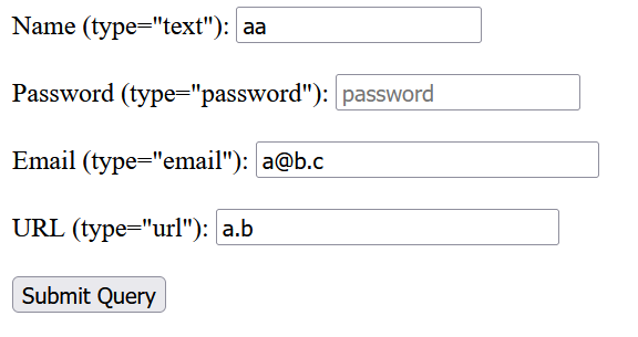
Example: Try out the following input controls.
<form action="submit.php" method="get">
Name (type="text"): <input type="text" name="username" placeholder="Your username"
    required><br><br>
Password (type="password"): <input type="password" name="passwd" placeholder="password"
    required minlength="4" maxlength="8"><br><br>
Email (type="email"): <input type="email" name="email" size="30" required><br><br>
URL (type="url"): <input type="url" name="url" size="30"><br><br> <!--optional-->
<input type="submit">
</form>
<select> with <optgroup> and <option>
Try the following codes:
<select name="choice">
  <option value="milk">Milk</option>
  <optgroup label="Fruits">
    <option value="apple">Apple</option>
    <option value="orange">Orange</option>
  </optgroup>
  <optgroup label="Vegetables" disabled>
    <option value="potatoes">Potatoes</option>
    <option value="tomatoes">Tomatoes</option>
  </optgroup>
</select>
Suggested Inputs (with Auto-complete) <datalist> (vs. <select>)
For example,
<!-- Must select one of the options -->
Choose a Color (select): <select name="color">
  <option value="red">Red</option>
  <option value="green">Green</option>
  <option value="blue">Blue</option>
</select><br><br>

<!-- Provide a list of suggestions for auto-complete. You can enter your own value -->
Choose another Color (datalist): <input type="text" name="morecolor" list="colorlist">
<datalist id="colorlist">
  <option value="Red">
  <option value="Green">
  <option value="Blue">
</datalist><br><br>
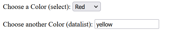
<datalist> merely provides a list of suggestions (and supports auto-complete on these suggestions) on a input text field. You can enter your own value.
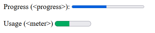
Progress Bar <progress> and Meter <meter>
The progress bar <progress> shows how far a task has progressed. Meter <meter> show the current value (in a known range) or percentage.
<label for="progress">Progress (<progress>):</label> <progress id="progress" value="48" max="100">48% (fallback)</progress><br><br> <label for="meter">Usage (<meter>)</label> <meter id="meter" value="4" min="0" max="10">4 out of 10</meter><br><br>
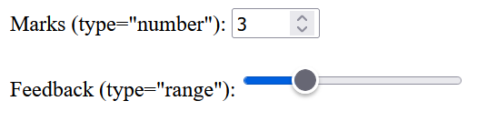
Numeric Inputs: <input type="number"> and <input type="range">
To be used for inputting number or number range, having different UI (See below). For example,
Marks (type="number"): <input type="number" size="6" name="marks" min="0" max="100"><br>
Feedback (type="range"): <input type="range" size="2" name="feedback" min="1" max="5">
Generated Output: <output>..</output>
Used to hold the output of JavaScript computation result (JavaScript is required). For example,
<form oninput="out.value=hello.value+username.value">
  <input type="text" id="hello" value="hello,"> <!--use "id"-->
  <input type="text" id="username" value="">
  <output name="out" for="hello username">enter something</output> <!--use "name"-->
</form>
Prior to HTML5, we typically use <div> or <span>.
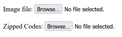
File Upload <input type="file"> and File Types accept Attribute
For <input type="file">, it is possible to accept only certain types of files, such as videos, images, audios,
specific file extensions, or certain media MIME types. For example,
<form action="file_upload.php" method="post" enctype="multipart/form-data">
  <!-- image file only via MIME type -->
  Image file: <input type="file" accept="image/*" title="Only images are allowed"><br><br>
  <!-- .rar or .zip -->
  Zipped Codes: <input type="file" accept=".rar,application/zip"><br><br>
  <input type="submit" value="Upload your file">
</form>
Notes:
- You need to set
enctype="multipart/form-data"in the<form>tag for file upload, which specifies how form data would be encoded while submitting to the server. - You can specify "
multiple" for multiple files upload.
Color Chooser via <input type="color">
Input control <input type="color"> creates a button-like control, with a color equal to the value attribute. Clicking this button opens up the color chooser. For example,
<input type="color" name="color" value="#ffff00">
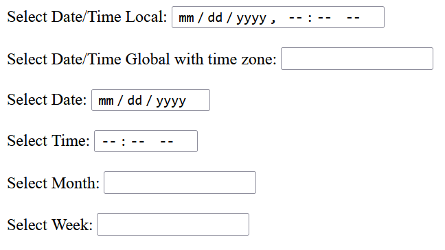
Data/Time Picker via <input type="datetime_local|datetime|date|time|month|week">
On a supported browser, it will pop up an appropriate date/Time picker. For example,
Select Date/Time Local: <input type="datetime-local" name="dt_local"><br><br>
Select Date/Time Global with time zone: <input type="datetime" name="dt"><br><br>
Select Date: <input type="date" name="date"><br><br>
Select Time: <input type="time" name="time"><br><br>
Select Month: <input type="month" name="month"><br><br>
Select Week: <input type="week" name="week"><br><br>
Attribute contenteditable
The boolean attribute contenteditable marks the element editable, for example,
<p contenteditable>This is an editable paragraph.</p>
<p contenteditable>
  This sentence is editable.
  <span contenteditable="false">But this sentence is NOT.</span>
</p>
HTTP GET/POST Request
The Request Parameter (Name-Value Pair)
Each input field is associated with a name-value pair, which will be submitted to the server, as part of the HTTP request. The name is identified by the name attribute of the input field; while the value could be the user input (for text fields), or identified by the value attribute (for checkboxes, radio buttons and list options).
For example,
<label>FirstName: <input type="text" name="firstname"></label>
   <!-- name=value pair is firstname=dataEnter -->

<label><input type="radio" name="gender" value="m">Male</label>
<label><input type="radio" name="gender" value="f">Female</label>
<!-- name=value pair is gender=m or gender=f, depending on which button is checked -->
When the form is submitted, the name-value pair will be sent to the server, as a so-called request parameter.
The Query String (All Name-Value Pairs)
When a user fills in the form and click the submit button, the request parameter from all the input fields, in the form of name=value pair, will be send to the server as part of the request. The processing URL is specified in the action attribute of the <form>. For a GET request, the request parameters are append behind the URL separated by a '?'. The name=value pairs are separated by an '&'. Since the URL cannot accept special characters (such as blank and '~'), they will be encoded in the form of %hh, where hh is the ASCII code of the special character. e.g., '~' as %7E; blank as %20 or '+'. This is known as URL encoding.
For example, suppose that the action URL is http://www.example.com/test/submit.php, with request parameters username=peter, password=1234, gender=m, and comment=testing 1 2 3, the resultant GET request URL is:
http://www.example.com/test/submit.php?username=peter&password=1234&gender=m&comment=testing+1+2+3
Take note that the password are not encrypted, although it does not appear on the screen.
GET vs. POST Request Methods
For GET, the query string is appended behind the action URL. For POST, the query string is sent in the request body, and does not show up in the URL. POST is generally preferred as it can send more data, and does not mess up the URL.
How the Server Processes the Request Parameters?
The server-side program receives the query string; URL decodes the special characters; and performs operations based on these parameters (e.g., query the database). It then returns an appropriate response to the client. I will not cover server side programming in this article. Read the respective server-side programming techniques such as PHP, Java Servlet, JSP, and etc.
[TODO] Simple example on PHP
Color
Color theme is the most important factor affecting the appearance of your web pages. I am NOT an expert on colors, but these are what I understood.
216 Browser-Safe Colors?
Not too long ago, the computer monitors can display only 256 colors (aka palettes). Hence, web designers created the so-called 216 browser-safe colors, which can be shown correctly and quite consistently on all the computer displays. Today, most of the computer monitor can display 24-bit true colors, is it still relevant?
The 216 browser-safe colors are obtained mathematically (and not artistically or psychologically, and hence really really ugly), by putting values of #00, #33 (51), #66 (102), #99 (153), #CC (204), #FF (255) on each of the RGB triplets (6×6×6=216).
Most computer monitors today are at least capable of display 16K (or 16384) colors. You could put values of #00, #08, #10, #18,..., #F0, #F8, #FF on each of the RGB triplets.
HTML/CSS Color Names
Again, the HTML/CSS provides many color names, such as red, green, blue, grey, and etc. Again, the color value for these color names are obtained numerically. As a result, these colors are really really ugly. Don't use them!
Furthermore, you can't form a color theme by picking these names (lightblue+lightgreen+...??).
Designing Color Themes
Some online sties such as ColorHexa (@ https://www.colorhexa.com) can help you setup a color scheme. You need to pick your "Primary" color. It could generates the "Complementary", "Analogous", "Split Complementary" "Triade", "Tetrade" and "Monochromatic" Colors.
You can also try WebFX (https://www.webfx.com/web-design/color-picker/), and many more.
You also need to design a set of traffic-light color (red, amber, green) for your states and buttons.
Rules-of-Thumb of Using Colors
- Nothing beats black text on white background for reading text on a computer monitor!!!
- Stay monochrome (black on white). Use an additional color for highlighting headings, links, and etc.
- Use color with restraint. There is no reasons to use more than 4 colors.
- Use a lightly shaded background.
- Use color in a box.
Fonts & Typography
Font Types
The choice font faces are probably the one of the most important factor affecting the appearance of your web pages. These are the main categories of fonts:
- Serif: Serif fonts come with little horizontal tails, to guide you in reading a long (horizontal) line of texts. Serif fonts are used in printed materials such as newspaper for easy reading. For example,
Lorem ipsum dolor sit amet, consectetur adipisicing elit, sed do eiusmod tempor incididunt ut labore et dolore magna aliqua. Ut enim ad minim veniam, quis nostrud exercitation ullamco laboris nisi ut aliquip ex ea commodo consequat. Duis aute irure dolor in reprehenderit in voluptate velit esse cillum dolore eu fugiat nulla pariatur. Excepteur sint occaecat cupidatat non proident, sunt in culpa qui officia deserunt mollit anim id est laborum.
- San-serif: without the little tails, used for computer display and short heading in printed materials. [I don't know why? Probably you are not suppose to read long lines from the computer screen.]
Lorem ipsum dolor sit amet, consectetur adipisicing elit, sed do eiusmod tempor incididunt ut labore et dolore magna aliqua. Ut enim ad minim veniam, quis nostrud exercitation ullamco laboris nisi ut aliquip ex ea commodo consequat. Duis aute irure dolor in reprehenderit in voluptate velit esse cillum dolore eu fugiat nulla pariatur. Excepteur sint occaecat cupidatat non proident, sunt in culpa qui officia deserunt mollit anim id est laborum.
- Monospace (Fixed-width Font): the old typewriter fonts, used today for displaying program code, where spacing and alignment is crucial.
Lorem ipsum dolor sit amet, consectetur adipisicing elit, sed do eiusmod tempor incididunt ut labore et dolore magna aliqua. Ut enim ad minim veniam, quis nostrud exercitation ullamco laboris nisi ut aliquip ex ea commodo consequat. Duis aute irure dolor in reprehenderit in voluptate velit esse cillum dolore eu fugiat nulla pariatur. Excepteur sint occaecat cupidatat non proident, sunt in culpa qui officia deserunt mollit anim id est laborum.
- Cursive:
- Artistic:
Fonts look good in prints may not look good on screen. You are recommended to use sans-serif fonts for the web pages, which are displayed on computer screen.
Typographic Terminologies
- Font Style: bold, italic, underline, strike through, double-strike through, double-underline.
- Kerning: Space between characters
- Leading: Space between lines
- emboss, engrave, outline, shadow
- em-space: a space equals to the width of letter 'm'
- em-dash: a dash equals to two hyphens, for indicating break in a sentence
Font Testing Paragraph
This is the famous standard "Lorem Ipsum" passage, used since the 1500s, for testing the typesetting:
Google Fonts
Today, the most frequently used font for web design is certainly the Google Fonts, which is free, open-source, and available on all platforms (Windows, macOS, mobiles, etc.).
See Google Font mother site and my "HTML/CSS Basics" article on how to use Google Fonts.
The popular google fonts are: "Open Sans", "Roboto", "Roboto Mono" (monospace), ...
Other Non-Google Common Fonts
This table shows you some of the common fonts.
| Serif | San-serif (Body) | San-serif (Heading) | Monospace |
|---|---|---|---|
| (We use Google Fonts for web these days. The fonts below are outdated for web.) | |||
| Times New Roman | Segoe UI (Segoe) | Trebuchet MS (uc) | Lucida Console |
| Georgia | Tahoma | Trebuchet MS (lc) | Courier New |
| Palatino | Helvetica | Segoe UI | Consolas |
| Arial | Verdana | Courier | |
| Lucida Sans Unicode | Century Gothic | ||
| Calibri | |||
In CSS, fonts are specified in property font-family. You can use generic family names such as "serif", "sans-serif", "monospace", and "cursive". The actual font used depends on the individual browser's settings.
Which Font Should I Use?
This is a million-dollar question. Some sans-serif font is nice when use in body text (normal weight, small font size, may need italics), others are suitable for use in heading (bold, bigger font size, uppercase). Some fonts are nice in lowercase, but not too nice in uppercase. Some nice fonts are not available in all the browsers (Windows 2000/XP/Vista/7, macOS, Linux?). For web publishing, you need to select one that most of your readers can enjoy.
You probably want to use different fonts for body texts and headings:
- Headings: use bigger font-size (and most probably in bold face) to draw readers' attention, and help to organize the ideas. There are usually a few levels of headings. Set the letter-spacing for headings.
- Body Texts: comprises the main bulk of your writing. Use smaller but legible font-size. Use italics or bold to emphasize certain terms or phrases.
These are my choices of fonts for web publishing (i.e., screen fonts, NOT printing fonts).
For Program Codes - Use Monospace or Fixed-width Font
Consolas (Windows - designed for Visual Studio 2005) is my first choice, but may not be generally available. Zero(0)/oh(O), one(1)/eye(I)/else(l) are clearly differentiated. It has a nice good italic style 1234567890.
A quick brown fox jumps over a lazy dog 1234567890
A quick brown fox jumps over a lazy dog 1234567890
Courier New (Windows & macOS) or Courier (macOS) is the most common choice. Zero(0)/oh(O) are not clearly differentiated, One(1)/eye(I)/else(l) are better. This is the italics style 1234567890.
A quick brown fox jumps over a lazy dog 1234567890
A quick brown fox jumps over a lazy dog 1234567890
For Body Texts
Use sans-serif fonts which look good in normal weight, smaller-size, italics style.
Segoe UI (Window, macOS(?)): My choice for these pages.
A quick brown fox jumps over a lazy dog 1234567890
A quick brown fox jumps over a lazy dog 1234567890
Tahoma (Windows): designed for legibility on the screen. It is narrower and more condensed than Verdana, but broader than Arial.
A quick brown fox jumps over a lazy dog 1234567890
A quick brown fox jumps over a lazy dog 1234567890
Arial (Windows & macOS) Helvetica (macOS): although not specially created for screen, it looks good on screen, but a bit too common.
A quick brown fox jumps over a lazy dog 1234567890
A quick brown fox jumps over a lazy dog 1234567890
Verdana (Window & macOS): the most commonly used font for web publishing. The normal weight is broader for legibility. However, the bold fact is too broad.
A quick brown fox jumps over a lazy dog 1234567890
A quick brown fox jumps over a lazy dog 1234567890
Lucida Sans Unicode/Lucida Sans (Windows): although not specially designed for screen, but it look on screen.
A quick brown fox jumps over a lazy dog 1234567890
A quick brown fox jumps over a lazy dog 1234567890
Calibri (Windows): it is a new font in Windows Vista which looks good on screen and print, but may not be available in most of the non-vista browsers.
A quick brown fox jumps over a lazy dog 1234567890
A quick brown fox jumps over a lazy dog 1234567890
For Headings
Use sans-serif fonts which look good in bold, bigger-size, and uppercase.
Trebuchet MS (Windows & macOS): created for the screen, especially nice looking in UPPERCASE 'M' '&' 'W'. Good for larger-font size, but not smaller-font size for body texts.
A quick brown fox jumps over a lazy dog 1234567890
A quick brown fox jumps over a lazy dog 1234567890
Verdana (Window & macOS): the most commonly used font for web publishing. However, the bold fact is too broad.
A quick brown fox jumps over a lazy dog 1234567890
A quick brown fox jumps over a lazy dog 1234567890
Serif Fonts
If you need one...
Georgia (Windows & macOS): specially created for screen. Nice looking but I seldom use serif font for web pages.
A quick brown fox jumps over a lazy dog 1234567890
A quick brown fox jumps over a lazy dog 1234567890
Times New Roman (Windows) and Times (macOS): The most commonly used serif font.
A quick brown fox jumps over a lazy dog 1234567890
A quick brown fox jumps over a lazy dog 1234567890
Palatino Linotype (Windows) and Palatino (macOS): another good choice for serif font.
A quick brown fox jumps over a lazy dog 1234567890
A quick brown fox jumps over a lazy dog 1234567890
Others (Cursive, Artistic)
Century Gothic (Window, macOS(?)): This is quite a very interesting and artistic font. The font width of each letter varies tremendously. The bold face seems to be more regular. How are the italics?. unusual question mark?!
A quick brown fox jumps over a lazy dog 1234567890
A quick brown fox jumps over a lazy dog 1234567890
Comic Sans MS (Window, macOS(?)): Over-used nowadays.
A quick brown fox jumps over a lazy dog 1234567890
A quick brown fox jumps over a lazy dog 1234567890
Font Files
Font File Types
.eot(Embedded Open Type): work only in IE..ttf(True Type) and.otf(Open Type): used by the system, word processor and most of the browsers..woff(Web Open Font Format): new font format design specifically for the web. They are basically compressed version of.ttfor.otf. They are smaller in file size and hence, can be downloaded faster..svg(Scalable Vector Graphic): not commonly used for web.
Besides the font types, up to 4 font-variant files can be associated with a particular font - for regular (normal), bold, italic, bold-italic, respectively. The font-family names are: xxx, xxxBold, xxxItalic, xxxBoldItalic, respectively.
Embedded Web Fonts via @font-face
CSS 3 introduces a feature called @font-face, which instructs the browser to download a font on the fly.
- Firstly, save your font files, e.g., under
fontsub-directory of the CSS directory. - Declare the font-family name and specify the font path via
@font-facedirective:@font-face { font-family: xxx; /* declare the font name */ src: url("font/font-filename.ttf"); /* location of font file */ }
Notes:- One
@font-facedirective is needed for each font family. - You can use multiple
srcto load different font files (e.g., one each for.ttf,.otf,.woff).
- One
- You can now use the font in your style as usual, via the
font-familyproperty:body { font-family: xxx, ....; }
Suggestions
"Don't use too many fonts. It looks ugly. It is distracting. It makes you reader work too hard. Give them a break!"... I read this paragraph somewhere.
Use a font for the body. Use another font for heading. Use a monospace font for program codes and listing.
Use Google Fonts for webapp.
These are the conservative fonts, available on most systems (Windows, macOS), that won't go wrong:
- Times (Serif)
- Arial, Helvetica (Sans-Serif)
- Courier (monospace)
Images
Graphics File Formats
BMP (Windows BitMaP)
- Uncompressed, large but fast (no need to decompress).
- Small images used for wallpaper, background, and Windows objects.
GIF (Graphic Interchange Format)
- GIF has two versions: GIF87a, GIF89a.
- Lossless compressed using LZW (as in PKZip, WinZip), but supports only 256 colors.
- Palette-based, limited to 256 color palettes. No good for full-color 24-bit real photo, best used for line art, logo, cartoon and so on.
- Progressive GIFs to get a sense of the image.
- Transparent GIFs (with see-thru background): Of the 256 colors palettes, one of palette can be chosen as the background. The background palette can be set to "transparent" for a see-thru effect.
- Animated GIFs: Sequence of GIF images shown repeatedly. Much simpler and faster than server-push or other animation technology.
- There was a patent issues on using GIF, resulted in a new PNG (Portable Network Graphic) format and the burn-all-gif campaign. The original LZW patent already lapsed in 2003-2004, and the GIF can be used freely now (??).
PNG (Portable Network Graphics)
- Lossless.
- More efficient compression algorithm than GIF (using LZW).
- No animation.
- Support transparency.
- Can be used for computer-generated image, as well as photos (but not as good as JPEG).
- How many colors? PNG8 supports 256 color palettes with 1-color transparency (replacement for GIF); PNG24 supports 24-bit true color; PNG32 supports 24-bit color plus 8-bit alpha channel (with 256-level of transparency). (JPEG and GIF do not support alpha channel.)
JPEG (Joint Photographic Expert Group)
- Lossy compressed using DCT with quantization.
- Support 24-bit true color for real-life photo.
- Progressive JPEGs similar to interlaced GIFs, to get a sense of the image.
- No transparency support.
- No animation.
SVG (Scalable Vector Graphics)
- Uses vector drawing, hence, small size, lossless, and flexibility in resizing without losing details.
- Not widely supported yet (especially older versions of IE).
Why Can't JPEG Support Transparency?
The primary reason is that JPEG compression is lossy. That is, a image pixel of a certain RGB value, may not recover its original RGB value exactly (but close) after compression and decompression. Suppose a certain (Rx,Gx,Bx) triplet of the original uncompressed image is picked to be transparent. This triplet is compressed into JPEG format for storage and transmission. It has to be decompressed for display. However, due to the lossy compression algorithm, you may not get back the original (Rx,Gx,Bx) value (but somewhere very close). Thus, the pixel will not be shown as transparent. On the other hand, other pixels with triplet of nearby value such as (Ry,Gy,By) must be decompressed into (Rx,Gx,Bx), and be shown as transparent.
Rule of thumb
- Your primary objective shall be having the smallest image size (shortest download time) with acceptable image quality on the display console.
- Use JPEG for 24-bit color photos. Use GIF/PNG for 256-color line arts, cartoons, and drawing (all the drawings in my website are saved in GIF/PNG).
- Use GIF for animation.
- Use GIF/PNG for transparency.
- 72 dpi (or possibly 120 dpi) for web images is sufficient for screen display. This is because a typical display console supports about 60-96 dpi. Take not that quality printing (e.g., printing photos) requires a much higher dpi.
Using Images
- Make it "light"! Do not embed a 5MB image. You don't need 600-dpi resolution for displaying image on the computer screen [you need 300dpi for good printing and 600dpi for high-quality printing]. 72 to 96 dpi, or in extreme case - 120 dpi, is good enough for screen display. Use a image editing software to scale down the image resolution before putting on your web page.
- Don't let the browser resize your image, even worst, ask the browser to reduce the size of your image (this is a waster of the precious network bandwidth, computer processing power, and generates more heats). Do it yourself!
- [This is difficult!] Tune your images' color tone (via the alpha channel), to bend in with the color theme of your website.
Responsive Web Design (RWD)
Responsive Web Design (RWD) lets you change the layout of a page based on the browser's window width, so as to present the page in a readable manner on all devices (from smartphones to tablets to desktops) without creating multiple versions for your website.
The strategies are:
- Stack columns on small devices for multi-column design: Multi-column design looks good on desktops (or possibly tablets in landscape), but not on smartphones. You can stack on columns on top of each other on small devices, by conditionally removing the
floatproperty of the columns. - Flexible (Relative) page width: Set the width of your content divisions to
autoor100%, instead of using absolute pixel numbers. - Shrink margin, padding, and white spaces for small devices.
- Shrink the font size, especially for headings on small devices.
- Collapse the navigation menu-bar items for small devices into a pull-down menu.
- Hide or Collapse less important contents for small devices.
- Use smaller resolution images and videos for small devices.
It is common to create 3 (or more) sets of media queries for different devices - smartphone (width <= 480), tablets (481 <= width <= 768), and desktop (width >= 769). Some designers choose to use 1024 instead of 768.
Viewport
"Mobile" browsers render web pages in a virtual window called viewport, which is usually wider than the screen width, so that they do not need to squeeze the page into the screen. Users can pan or zoom to see the different parts of the web page.
Modern mobile browsers support a <meta> tag to control the viewport, which is typically set as follows for responsive web design:
<meta name="viewport" content="width=device-width, initial-scale=1">
The viewport's width is set to the device-width. If you screen resolution is 1920x1080, your viewport width is 1920. Many devices allocate many physical pixels to display one logical pixel. If this is not set correctly, the browser will show your webpage with its native resolution, which is often a zoom-out view with small texts and images.
The initial-scale sets the zoom level when the page is first loaded (to no zoom in the above example).
Alternatively, you can also use the CSS @viewport at-rule (instead of the HTML <meta> element) to set the viewport, as follows:
@viewport {
  width: device-width;
  initial-scale: 1;
}
CSS Media Queries
CSS3 media queries let you conditionally apply styles based on the media type (type of device/media, e.g., screen, print or handheld) and media features (such as the availability of color or viewport dimensions min-width max-width). In other words, you can use media queries to conditionally assign different styles for smartphones, tablets and desktops. The syntax is:
// General structure
@media media-type and media-feature { css-rules }

// On media type
@media print { css-rules }

// On media type and media feature
@media screen and (max-width: 800px) { css-rules }

// On media feature, with media tpe of 'all'
@media (orientation: landscape) { css-rules }
The available media-types are:
- all: all deveices
- screen:
- print:
- handheld:
- projection:
- aural: speech systems
- embossed:
- braille:
- tv:
- tty: terminals, portables.
- embossed:
Examples of media type:
@media print {    /* for printed document */
   html { background-color: white }
}

@media not print {   /* except printed document */
   html { background-color: light-gray }
}

@media only screen {   /* for screen only */
   html { background-color: green }
}
Media Queries in HTML <link> Element via Attribute media
You can apply media query in HTML <link> element to load different style sheets for different window width, e.g.,
<link href="css/small.css"  rel="stylesheet" media="(max-width:480px)" >
      <!-- User small.css if window width <= 480px -->
<link href="css/medium.css" rel="stylesheet" media="(min-width:481px) and (max-width:768px)" >
      <!-- Use medium.css if 481px <= width <= 768px -->
<link href="css/large.css"  rel="stylesheet" media="(min-width:769px)" >
      <!-- Use large.css if window width >= 769px -->
Media query is performed via the additional attribute media in the <link> element.
Media Queries in CSS
You can also use media queries in CSS to load difference style sheets via the CSS @import directive, e.g.,
@import url("css/base.css");  /* no media query, default style for all window width */
@import url("css/medium.css") (min-width:481px) and (max-width:768px);
@import url("css/small.css")  (max-width:480px);
The above is known as Desktop-First design, where default styles are design based on the desktops, and customized styles for smaller devices.
Embedded Media Query in Styles
You can apply media query in style rules to condition style rules via CSS @media directive, e.g.,
/* No media query, default styles for desktop */
body { ...... }
h1, h2, h3, h4, h5, h6 { ...... }

/* Styles for medium devices - override the default */
@media (min-width:481px) and (max-width:768px) {
   body { ...... }
   h1, h2, h3, h4, h5, h6 { ...... }
}

/* Style for small devices - override the default */
@media (max-width:480px) {
   body { ...... }
   h1, h2, h3, h4, h5, h6 { ...... }
}
Again, this is a Desktop-First design, where you design the styles for desktops (as defaults), and customized styles for smaller devices (that override the defaults).
CSS Flexible Box Layout (Flexbox)
Flexbox is a box model designed for user interface, to accommodate different, unknown screen sizes. A flex container expands items to fill available space and shrinks them to prevent overflow.
Bootstrap uses flexbox to support responsive web design
Example 1: Arrange items in a container
<!DOCTYPE html>
<html lang="en">
<head>
<meta charset="utf-8">
<title>Flexbox Test</title>
<style>
div#container {
  display: flex;
  flex-direction: row;      /* try column */
  align-items: center;      /* vertical alignment */
  justify-content: center;  /* horizontal alignment */
  width: 80%;
  height: 400px;
  background-color: lightgray;
}
div.item {
  width: 250px;
  height: 100px;
  margin: 10px;
  background-color: lightblue;
}
</style>
</head>
<body>
<div id="container">
  <div class="item">A Flexbox Item</div>
  <div class="item">A Flexbox Item</div>
  <div class="item">A Flexbox Item</div>
</div>
</body>
</html>
Try:
- running the above code
- changing the screen size, and observe how the UI changes.
- changing
flex-directionfromrowtocolumn. - removing the
align-items(items align from top vertically) andjustify-content(items align from left horizontally).
Example 2: Optimally fitting items to container
<!DOCTYPE html>
<html lang="en">
<head>
<meta charset="utf-8">
<title>Flexbox Test</title>
<style>
div#container {
  display: flex;
  flex-direction: row;
  flex-wrap: wrap;
  justify-content: flex-start;
  align-content: stretch;
  align-items: stretch;
  height: 100%;
  background-color:lightgray ;
}
div.item {
  flex-grow: 1;
  flex-shrink: 0;
  flex-basis: 200px;
  height: 100px;
  margin: 10px;
  background-color: lightblue;
}</style>
</head>
<body>
<p>Try resizing your screen and observe how the items stack on top of the others</p>
<div id="container">
  <div class="item">Flexbox Item 1</div>
  <div class="item">Flexbox Item 2</div>
  <div class="item">Flexbox Item 3</div>
  <div class="item">Flexbox Item 4</div>
  <div class="item">Flexbox Item 5</div>
</div>
</body>
</html>
Try:
- Resize your screen and observe how the items stack on top of the others
Responsive Image using <img>'s srcset and sizes Attributes
srcset with sizes
For example,
<img sizes="(min-width: 1600px) 600px,
            (min-width: 900px) 50vw,
            40vw"
     srcset="img/test-300.jpg 300w,
             img/test-600.jpg 600w,
             img/test-900.jpg 900w,
             img/test-1200.jpg 1200w"
     src="img/test-600.jpg" alt="test image">
The attribute sizes is similar to media queries, with a list of media condition and its size
- If the viewport is larger than 1600px, display in 600px.
- Else if the viewport is larger than 900px, display in 50% width.
- Else display in 40% width. Media condition shall be omitted for last item.
The attribute srcset provides a list of available image URLs with a width.
The src is a mandatory attribute. In case of srcset, src will serve as the fallback image if the browser does not support srcset.
srcset without sizes
You can use srcset without the sizes, e.g.,
<img src="img/test-600.jpg" alt="test image"
     srcset="img/test-300.jpg 1x,
             img/test-600.jpg 2x,
             img/test-900.jpg 3x">
The srcset provides the list of available images, with a device-pixel ratio x descriptor. If the device-pixel ratio is 1, use the first image and so on.
Responsive Image using <picture> and <source> elements
For example,
<picture>
  <source media="(min-width: 900px)" srcset="test_big.jpg">
  <source media="(min-width: 600px)" srcset="test_medium.jpg">
  <img src="test_small.jpg" style="width:auto" alt="test image">
</picture>
If the screen width is more than 900px, use "test_big.jpg". Else if the screen width is more than 600px, use "test_medium.jpg". Else use "test_small.jpg".
LESS - CSS Preprocessor
A CSS preprocessor (or Stylesheet Language) lets you write styles using programming constructs and then compile into the final CSS. src, which is mandatroy, is meant as fallback.
It allows you to:
- Use programming constructs such as variables, mixins and functions.
- Automatically include vender prefixes.
- Combine style sheets and minify them to reduce download times.
It makes CSS more maintainable, themable and extendable.
The two most common CSS preprocessors are LESS and SASS . I will cover LESS in this article.
Getting Started
Running LESS under Node.js
- Install Node.js (@ https://nodejs.org/), which is a standalone JavaScript Engine.
- Install LESS under Node.js via npm (Node Package Manager):
$ npm install -g less
- To run the Less Compiler (lessc):
$ lessc styles.less > styles.css
      // To output minified CSS, add -x option.
Running Less under Browsers
You can also run the LESS compiler under a browser via the client-side JavaScript less.js (without installing Node.js):
- Download
less.js(@ https://github.com/less/less.js/archive/master.zip). - Place your less script in a
<link>tag ashref, withrel="stylesheet/less", in the<head>section in your page. We typically keep our less scripts under the sub-directoryless. - Include
less.jsin a<script></script>tag, after the<link>tag. - For testing, you can optionally use script
less.watch(), which activates the "watch" mode, to automatically recompile the CSS and refresh the web page, whenever the less file changes.
<!DOCTYPE html>
<html lang="en">
<head>
<meta charset="utf-8">
<title>Less Template</title>
<link rel="stylesheet/less" href="less/myStyle.less" >
<script src="js/less-2.5.0.min.js"></script>
<script>
// Activates the "watch" mode, to refresh the CSS whenever the less file changes.
less.watch();
</script>
</head>
<body>
<h1>Testing Less</h1>
<p>Lorem ipsum dolor sit amet, consectetur adipiscing elit, sed do eiusmod tempor
incididunt ut labore et dolore magna aliqua.</p>
</body>
</html>
Less by Examples
I extracted codes from Bootstrap's less files (@ http://getbootstrap.com/) to show you some production examples.
Example 1: Using Variables
Create the following less script called "LessExVar.less" and save under sub-directory "less".
In your text editor, associate the ".less" file type with CSS, for syntax highlighting. Less syntax is not identical with CSS but close enough.
// less/LessExVar.less: Using variables

// Define the variables
@gray-base:  #000;       // Declare a variable with a value
@gray-dark:  lighten(@gray-base, 20%);  // Apply less built-in color function lighten()
@text-color: @gray-dark;  // Declare a variable with a value from another variable
@body-bg:    #fff;

@font-family-sans-serif: "Helvetica Neue", Helvetica, Arial, sans-serif;
@font-family-serif:      Georgia, "Times New Roman", Times, serif;
@font-family-monospace:  Menlo, Monaco, Consolas, "Courier New", monospace;
@font-family-base:       @font-family-sans-serif;
@font-size-base:         14px;
@line-height-base:       1.428571429; // 20/14

@headings-color:         #337ab7;
@headings-font-family:   inherit;
@headings-font-weight:   500;
@headings-line-height:   1.1;
@font-size-h1:           floor((@font-size-base * 2.6)); // ~36px
                            // Apply arithmetic multiplication on variable
                            // and less built-in function
@font-size-h2:           floor((@font-size-base * 2.15)); // ~30px

// Using the variables
body {
  font-family:      @font-family-base;
  font-size:        @font-size-base;
  line-height:      @line-height-base;
  color:            @text-color;
  background-color: @body-bg;
}

h1,
h2 {
  font-family: @headings-font-family;
  font-weight: @headings-font-weight;
  line-height: @headings-line-height;
  color:       @headings-color;
}

h1 { font-size: @font-size-h1; }
h2 { font-size: @font-size-h2; }
The generated CSS is:
body {
    background-color: #ffffff;
    color: #333333;
    font-family: "Helvetica Neue",Helvetica,Arial,sans-serif;
    font-size: 14px;
    line-height: 1.42857;
}
h1, h2 {
    color: #337ab7;
    font-family: inherit;
    font-weight: 500;
    line-height: 1.1;
}
h1 {
    font-size: 36px;
}
h2 {
    font-size: 30px;
}
Create the following HTML page ("LessExVar.html") to test the tags defined in less script (<body>, <h1> and <h2>):
<!DOCTYPE html>
<html lang="en">
<head>
<meta charset="utf-8">
<title>Less Template</title>
<link rel="stylesheet/less" href="less/LessExVar.less" >
<script src="js/less-2.5.0.min.js"></script>
<script>
// Activates the "watch" mode, to refresh the CSS whenever the less file changes.
less.watch();
</script>
</head>
<body>
<h1>Testing Less</h1>
<h2>Less is a CSS Preprocessor</h2>
<p>Lorem ipsum dolor sit amet, consectetur adipiscing elit, sed do eiusmod tempor
incididunt ut labore et dolore magna aliqua.</p>
</body>
</html>
How It Works?
- A less variable is prefixed with a
@sign, in the form of@var-name. - You can apply less built-in functions (such as
lighten()andfloor()) and arithmetic operations (such as+,-,*and/) to variables.
On chrome, you need to run you web page through a web server, as less.js makes Ajax call to server. But, you can run on Firefox without a web server and see the generated CSS output via Firebug or Developer Tools.
We typically keep all the variables in another less file (say "variables.less"); and include the file via "@import variables.less;".
Example 2: Using Mixins
Mixins are similar to variables, but it can include a list of properties. It could take arguments too.
Create the following less script called "LessExMixin.less", under the "less" sub-directory:
// less/LessExMixin.less: Using Mixins

// Define the mixins
.center-block() {   // Center a block element
  display: block;
  margin-left: auto;
  margin-right: auto;
}

.size(@width; @height) {  // Set the width and height of a block, via argumets
  width: @width;
  height: @height;
}

// Using the mixins
#my-block {
  .center-block();    // parentheses are optional here
  .size(70%; 100px);  // passing in argument
}
The generated CSS are:
#my-block {
    display: block;
    height: 100px;
    margin-left: auto;
    margin-right: auto;
    width: 70%;
}
The test HTML page is:
<!DOCTYPE html>
<html lang="en">
<head>
<meta charset="utf-8">
<title>Less Template</title>
<link rel="stylesheet/less" href="less/LessExMixin.less" >
<script src="js/less-2.5.0.min.js"></script>
<script>
// Activates the "watch" mode, to refresh the CSS whenever the less file changes.
less.watch();
</script>
</head>
<body>
<h1>Testing Less</h1>
<h2>Less is a CSS Preprocessor</h2>
<div id="my-block">Lorem ipsum dolor sit amet, consectetur adipiscing elit, sed do eiusmod tempor
incididunt ut labore et dolore magna aliqua.</div>
</body>
</html>
How It Works?
[TODO]
Less Basics
@import
You can use the @import directive to include other less scripts or CSS files.
For example, the Bootstrap's main less file "bootstrap.less" consists of only @import statements, which can be easily customized to select the desired components.
// Core variables and mixins
@import "variables.less";
@import "mixins.less";
......

// Core CSS
@import "scaffolding.less";
......
Comments: /* ... */ and //
Less supports both multi-line comments /* ... */ and end-of-line comment //. (CSS supports only multi-line comments /* ... */, but NOT end-of-line comment //.)
The multi-line comment /* ... */ shows up in the compiled CSS; while the end-of-line comment // does not.
Variables: @var-name
A less variable is prefixed with an @ sign, in the form of @var-name.
For examples, in Bootstrap's "variable.less" and "scaffolding.less":
@gray-base:   #000;       // Declare a variable with a value
@gray-dark:   lighten(@gray-base, 20%);  // Invoke a less color function (#333)
@body-bg:     #fff;
@text-color:  @gray-dark;  // Declare a variable with a value from another variable

@font-family-sans-serif:  "Helvetica Neue", Helvetica, Arial, sans-serif;
@font-family-serif:       Georgia, "Times New Roman", Times, serif;
@font-family-monospace:   Menlo, Monaco, Consolas, "Courier New", monospace;
@font-family-base:        @font-family-sans-serif;
@font-size-base:          14px;
@line-height-base:        1.428571429; // 20/14

body {
  font-family:      @font-family-base;
  font-size:        @font-size-base;
  line-height:      @line-height-base;
  color:            @text-color;
  background-color: @body-bg;
}
Notes:
- You cannot re-assign a value to a less variable. A variable is actually a constant in less and can only be defined once.
- Variables are lazy loaded. That is, you can place a variable declaration after it is referenced.
- You can use
@@var, where@varholds a variable name.
Types
You can use the built-in type functions to check the type of a variable. There are:
- isnumber(value): Return boolean
trueorfalse. - ispercentage(value)
- isstring(value)
- iscolor(value)
- isunit(value, unit)
- ispixel(value)
- isem(value)
- isurl(value)
- isruleset(value)
- iskeyword(value)
For examples,
iscolor(#ff0);      //true
iscolor(blue);      //true
isstring("string"); //true
isnumber(1234);     //true
ispixel(56px);      //true
ispercentage(7.8%); //true
isunit(56px, px);   //true
A variable can also takes on a ruleset. For example,
@color-ruleset: {
  color: #fff;
  background-color: #000;
}
Variable Interpolation @{var-name}
To use a variable in selector or property name (on the LHS), URL or @import filename (within a quoted string on the RHS), you need to interpolate the variable in the form of @{var-name}. For example,
// Variable for selector name
@logo-selector: logo;

#@{logo-selector} {
  ......
}

// Variable as part of URL in quoted string
@image-path: "../img";

body {
  color: #888;
  background: url("@{image-path}/background.png");
}
Clearly, the braces {...} are needed as delimiters for interpolation inside a quoted string.
Mixins
Mixins are a way of including ("mixing in") a set of properties from one rule into another rule.
For example, in Bootstrap's "mixins/center-block.less" and "mixins/size.less":
// Center-align a block level element
.center-block() {
  display: block;
  margin-left: auto;
  margin-right: auto;
}

// Set the width and height
// Mixins can take arguments and behave like functions.
// Arguments can take a default value.
.size(@width; @height: 100px) {
  width: @width;
  height: @height;
}
.square(@size) {
  .size(@size; @size);  // define via the above mixin
}

// Using the mixins
#my-block {
  .center-block();   // parentheses are optional
  .size(70%; 100px); // passing in arguments
}
- Mixins are similar to variables. But instead of holding a value, it holds a set of properties.
- Mixins can take arguments and behave like functions. Multiple arguments are separated by semicolon or comma, but semicolon is recommended as comma has other meaning (CSS list separator).
- Mixin's argument can take a default value, in the form of
@arg: default-value. - Mixins that ends with parentheses (e.g.,
.center-block()) will not be output in the CSS. - In calling the mixins, the parentheses are optional if there no argument is required.
- In calling the mixins, you can also pass parameters by name, instead of via position. For example,
#my-block {
  .size(@height: 100px; @width: 70%); // passing parameters by names instead of positions
}
You can also mix the ordinary class selector and ID selector. For example,
.center-block {  // This is an ordinary class selector
  display: block;
  margin-left: auto;
  margin-right: auto;
}

#header {  // This is an ordinary ID selector
  color: red;
}

// Mix-in class selector and ID selector
.foo {
  .center-block;  // Optional trailing parentheses
  #header;
}
Nested Selectors
Less's rule can be nested; while CSS cannot and supports only one-level of rules.
For examples, the following less rules:
@link-color:            #337ab7;
@link-hover-color:      darken(@link-color, 15%);
@link-hover-decoration: underline;

a {
  color: @link-color;
  text-decoration: none;

  // Nested selectors, where & refers to the parent
  &:hover,
  &:focus {
    color: @link-hover-color;
    text-decoration: @link-hover-decoration;
  }
}
will be unwrapped into the following CSS rules:
a {
  color: #337ab7;
  text-decoration: none;
}

// Nested selectors are unwrapped in CSS
a:hover,
a:focus {
  color: #22527b;
  text-decoration: underline;
}
Inside the nested less rule, you can use & to refer to the parent. The parent selector & is commonly used with pseudo class, such as :hover and :focus, as in the above example.
Nested selectors better reflect the hierarchy of the HTML document, hence, they are recommended.
Mixins with Selectors
Mixins can contain CSS properties (as in the above examples). They can also contain nested selectors. For examples,
// Mixin for Contextual backgrounds (with nested selector)
.bg-variant(@color) {
  // Mixin can contain CSS properties
  background-color: @color;
  // Mixin can contain nested selector too
  a&:hover {   // & refers to the parent
    background-color: darken(@color, 10%);
  }
}

// Using the above mixin
.foo {
  color: #fff;
  .bg-variant(red);
}
will be compiled into CSS:
.foo {
  color: #fff;
  background-color: red;
}

a.foo:hover {
  background-color: #cc0000;
}
Namespace
// Define a nested rule for mixin
#my-namespace {
  .foo {  // nested selector
    color: red;
  }
}

// Use the nested rule
.bar {
  #my-namespace > .foo;  // '>' denotes accessor for accessing nested selector
}
will be compiled into:
#my-namespace .foo {
  color: red;
}
.bar {
  color: red;
}
You can use the above technique to create namespaces.
Nested Directives
Directive such as @media can also be nested like selector. Unlike normal selector, there will be bubbling up to the top-level in the generated CSS.
For example:
.bg-color {
  @media screen {
    background-color: white;
    @media (min-width: 768px) {
      background-color: lightgrey;
    }
  }
  @media tv {
    background-color: black;
  }
}
will be compiled into the following CSS, where the directive @media is bubbling up to the top level:
@media screen {
  .bg-color { background-color: white; }
}
@media screen and (min-width: 768px) {
  .bg-color { background-color: lightgrey; }
}
@media tv {
  .bg-color { background-color: black; }
}
Arithmetic Operations
You can apply arithmetic operators, such as +, -, * and / to numbers and numeric measurements.
Take note that less can handle measurement units automatically. For examples,
10px + 5px ⇒ 15px;10px + 5 ⇒ 15px;10px + 20pt ⇒ 36.6667px;
Built-in Functions
Less provides a set of built-in functions, which operate on the variables. For example,
@gray-base:       #000;
// Invoke less color function lighten() to increase the brightness
@gray-darker:     lighten(@gray-base, 13.5%); // #222
@gray-dark:       lighten(@gray-base, 20%);   // #333
@gray:            lighten(@gray-base, 33.5%); // #555
@gray-light:      lighten(@gray-base, 46.7%); // #777
@gray-lighter:    lighten(@gray-base, 93.5%); // #eee
Refer to Less Function References @ http://lesscss.org/functions/.
Math Functions
- floor(number) and ceil(number): Return the floor or ceiling integer.
- round(number[, decimalPlaces]): Return the number rounded to the optional
decimalPlaces(default of 0). - percentage(number): Return the percentage in string of "xxx%".
- pow(base, exp) and sqrt(number)
- mod(number, base): Return number modulus base.
- min(value1, ..., valueN) and max(value1, ..., valueN): Return the minimum or maximum among the values.
- pi(): Return the value of pi.
- sin(angle), cos(angle), tan(angle): angle can be 2 (default of radians), 2deg (in degrees), 2grad (in gradians, 1 gradian is 1/400 turns).
- asin(number), acos(number), atan(number): return the angle in radians.
Color Operation Functions
Color Operation Functions typical takes 3 arguments:
- color: A color object.
- percent: in percent of 0-100%.
- method: optional with default of absolute. Set to
relativefor the adjustment to be relative to the current value.
The commonly-used color Operation Functions are:
- saturate(color, percent[, method]) and desaturate(color, percent[, method]): Increase/Decrease the saturation value of the color in the HSL color space, by the absolute/relative amount in percent of 0-100%.
- lighten(color, percent[, method]) and darken(color, percent[, method]): Increase/Decrease the brightness (lightness) value of the color in the HSL color space, by the absolute/relative amount in percent of (0-100%).
- fadeout(color, percent[, method]) and fadein(color, percent[, method]): Increase/Decrease the transparency (alpha channel) of a color, by the absolute/relative amount in percent of 0-100%.
- fade(color, percent): Set the absolute transparency (alpha channel) of a color, in percent of 0-100%.
- greyscale(color): Convert to grey scale, same as desaturate(color, 100%).
- spin(color, angle): Rotate the hue by the given angle (a positive or negative value in degree).
Conditionals or Guards
You can apply conditionals (or guards) using keyword when. For examples,
// with comparison operators: >, >=, =, =<, <
.foo (@a) when (@a = 88) { ... }
.foo (@a) when (@media = mobile) { ... }
.foo (@a; @b) when (@a > @b) { width: @a }

// with logical operators: and ,(or)
.foo (@a) when (isnumber(@a)) and (@a > 0) { ... }
.foo (@a) when (@a > 10), (@a < -10) { ... }
Search Engine Optimization (SEO)
To make your webpages search-engine friendly:
- Provide a meaning title in
<title>element. Don't give all your webpages the same title. - Add a description via the
<meta>element. - Provide keywords via the <meta> element. However, most of the search engines today ignore keywords, due to abuses.
- Provide a meaningful alternative texts to your images (via "
alt" attribute), or<figcaption>in HMTL5. - Use descriptive link text. Don't simply say "Click Me!".
For example,
<head>
  <title>HTML/CSS Tutorial: The Basics</title>
  <meta name="description" content="Basic HTML/CSS Tutorial for the beginners">
  <meta name="keywords" content="HTML, CSS, Tutorial, Basics, beginners">
  ......
</head>
SEO is the art of making your webpages more visible for the search engine.
[TODO]
Link To HTML/CSS References & Resources